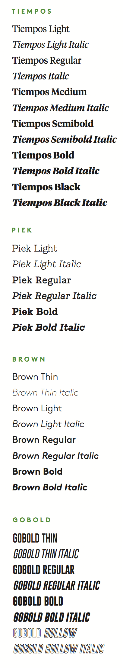
All attempts should be made to use Tiempos, Piek, Brown and GoBold.
All fonts (excluding GoBold) need to be purchased to be used. Fonts being used by individual colleges outside of the main University of Vermont communications department need to purchase extended font usage licenses.
Secondary Free Typefaces
While the four primary typefaces are highly recommended, there are alternative free typefaces. We recommend using:
- Playfair Display (serif) as an alternative to Tiempos Headline
- Roboto Slab (slab serif) in place of Piek
- Raleway (sans serif) in place of Brown
- GoBold (Condensed Headline) is already free (alternative for web Oswald)
All attempts should be made to use Tiempos, Piek, Brown and GoBold.
Current Web Uses
Currently installed on our UVM Drupal platform.
- Roboto (sans-serif)
- Oswald (sans-serif)
- Raleway (sans serif)
Headlines
Headlines, when being used for overarching University communications, should be set in Tiempos Medium - Black. The weight can vary based on the length of the headline in relation to the layout.
Headlines, when speaking specifically to the students, can be set in either GoBold bold, or Tiempos—depending on the tone of the layout.
You can use:
- Tiempos Medium
- Tiempos Medium Italic
- Tiempos Semibold
- Tiempos Semibold Italic
- Tiempos Bold
- Tiempos Bold Italic
- Tiempos Black
- GoBold Regular
- GoBold Bold
- GoBold Bold Italic
About these typefaces:
- Tiempos has an elevated, formal and timeless presence, while remaining contemporary with style elements that easily fit within the student aesthetic.
- GoBold is informal, assertive and bold. It holds its own when you want to make a bigger impact, or call something out when speaking in the student tone of voice.
Body Copy
Body copy should be set in either Brown Light or Piek Light. Body copy should never be smaller than 9pt. The maximum point size for body copy depends on the type of piece—larger posters can have body copy 12pt or more, while brochure and postcard body copy should be set around 9pt (Brown) or 9pt (Piek).
Purchasing Fonts
Above is the complete list of approved fonts. Depending on your project, it might not be necessary to purchase all. We suggest starting with headline fonts Tiempos Medium/Italic and Tiempos Semibold/Italic.
For body text (project dependent), you can choose one of the fonts such as Brown Light/Italic, Piek Light/Italic or Tiempos Light/Italic (Note: always purchase the italic version of the font).
Please note: UVM is currently investigating a refresh of our official font selections. We do not recommend purchasing font sets until that process is complete and new guidance is established.
- Classic Headline Serif: Tiempos Headline Family
- Slab Serif (used in body copy and sub headlines): Piek entire family
- Sans Serif (used in body copy, sub headlines and badges): Brown entire family