color stripes


Below are the logo guidelines established in fall 2017. These updated logos include a re-drawing of the tower in order to simplify its lines and improve reproduction at smaller scale and on diverse materials. This logo system refresh includes an update to the primary and secondary logos, as well as the creation of a promotional logo template.

This system ensures that official units and activities of the university carry our name out into the world, and that the university's reputation is enriched by the varied activities of our community.

Remember: logos are just one piece of the overall branding toolbox for the University of Vermont. All the elements of the Creative Style Guide, from patterns to badges to strong photography, help bring the university's story to life.

Primary Logo

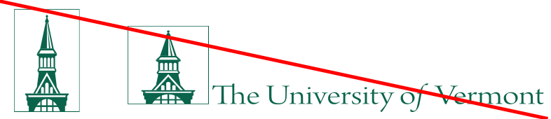
The type may be used alone, as can the tower, and their relation to each other is flexible dependent upon the context of the design layout, either horizontal:


University Logo - solid horizontal


Or stacked. The stacked logo is most commonly used when space is limited or when the logo must be placed in a grouping of other logos:

University Logo - outlined stacked


University Logo - solid stacked


Size

The width of the tower, whether with type or on its own, should not go smaller than .5” wide.

Color

The logo can be used in UVM Green, black or white. Choose a color that will be readable over the background color of your piece. When placing a logo over a photograph, choose an area of the photograph where it is mostly uniformly dark or uniformly light; areas of high contrast or too much texture will reduce readability.

The primary logo is appropriate in all instances of representing the university’s activities. Primary logos must be used on business cards and stationery.

Download logos

Secondary Logos

Although the primary logo should be the first logo an audience sees, it's sometimes appropriate to brand communications for established audiences with unit-specific marks. It’s always permissible and often advised to use the primary logo and include the name of the unit as a separate design treatment, visually apart from each other. Where that separation can’t happen is when the secondary logo can be useful.

Official units (schools, colleges, departments) of the University of Vermont must adhere to the secondary logo system, and may not create unique, individual logos to represent themselves.

Secondary logo example: Grossman School of Business


Secondary logo example: Arts and Sciences


Elements of the secondary logo

The secondary logo system employs Brown Regular, all caps, for the university's name. Brown Bold is used for the unit name, all caps. Text lines are justified.

Secondary logos are also available in black, white and UVM Green, and in horizontal and stacked versions.

Download logos

Promotional Logos

Promotional logos are a tool to visually brand UVM events, campaigns, initiatives, and organizations. Promotional logos leave room for creativity and flexibility, while staying aligned with UVM branding.

Promotional logo example: CREAM


Elements of the promotional logo

The name of the organization is to be stacked under the name of the university as in the secondary logo system. A clean and concise graphic that fits roughly into a square or circle format can appear to the left of the type, separated by a vertical one point rule.

Brown Bold and Gobold Bold can either be used in the organization name. Text should be justified.

Approvals for use of a graphic element in a promotional logo must be obtained from Creative Communications Services.

Logo Dos and Don'ts

Do:

  • Use the primary logo when communicating to external audiences unaffiliated with the university
  • Give the logo space around it, free from other logos and text
  • Use UVM Green, white, or black as logo color options
  • Reach out to Creative Communications Services with logo questions and needs

Don't:

  • Use previous versions of the UVM logo:

    Example of old logo


  • Change proportions of the logo:

    Example of misproportioned logo
     
  • Use college or school abbreviations as part of a logo
  • Use non-approved fonts with any part of the logo
  • Use UVM Green or black on dark backgrounds, or white on light backgrounds