All of the components a mobile responsive and reduce to 1-column viewing. We've tried to keep the names of the content blocks simple. But even so, here is a visual reference to tie the content block design to the name.
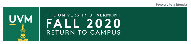
Masthead
The masthead for the newsletter is designed to use a UVM Secondary logo on the right side. A variation of the UVM Tower avatar is employed on the left. It breaks away from the traditional brand color which employs the primary-3 light green for the tower... as a harken to the 2020 "Green and Gold" challenge.
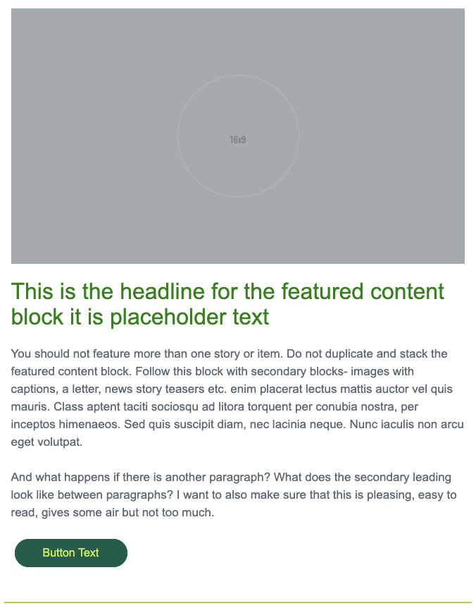
Featured Content Block
The Featured Content Block consists of a large horizontal image (6x4 or 16x9), a headline, body copy and optional CTA button. You should only use this block once in your e-Newsletter. The idea is that this content is at the top of the content hierarchy- it's most important and is elevated to the top position in the newsletter.
CTA Button
You should also use the CTA button only once in your e-Newsletter. It's the primary Call to Action-- the single most important action you want the user to do when they read your newsletter. All other call to actions are subordinate and should use the "text link with arrow" instead.
Text__Issue Date
This follows the masthead and is the date of your e-Newsletter's publication.

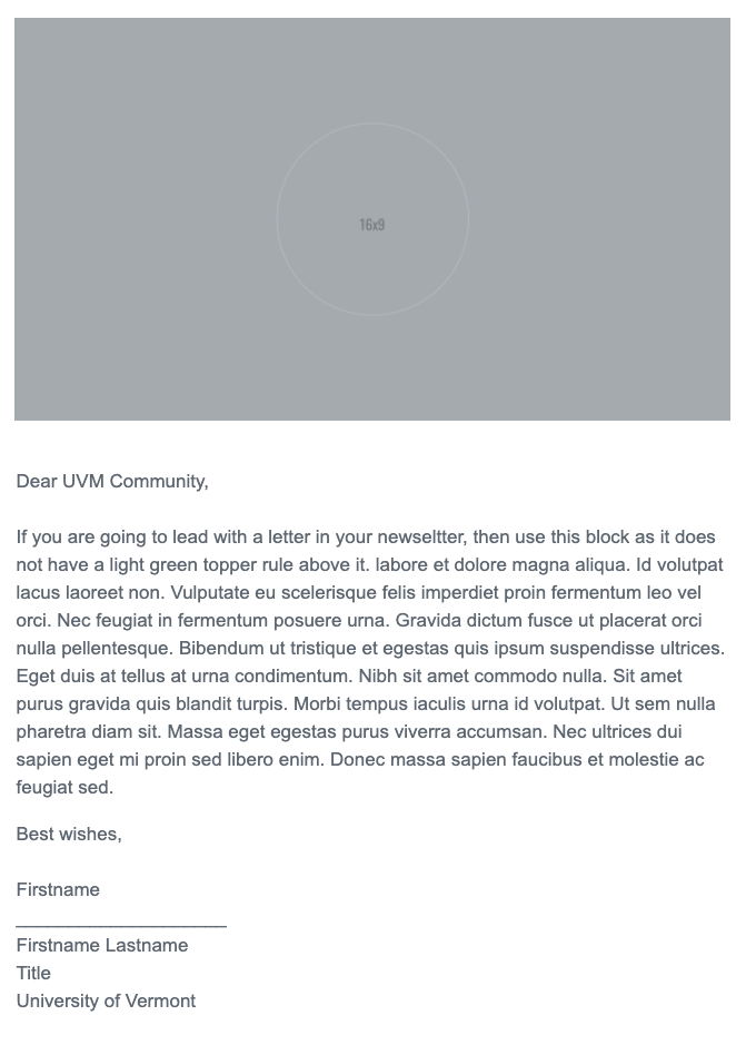
Text__Letter Block
After seeing how much use the "Letter Block" was getting, we made a separate Salesforce template called "Letter template". It consists of the mandatory masthead and footer with a letter block like the one shown here. You can also just always grab the "Letter Block" from the content blocks and add it to your newsletter. The image is optional and can be deleted.
Text Block__2 columns
This is a text-only block with an optional text link. These are stackable. On mobile they become 1-up.
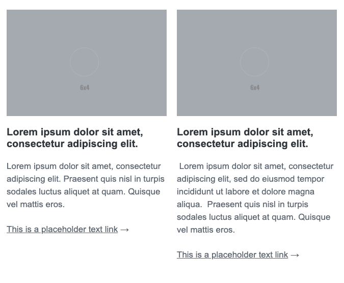
Rich Text Block__2 columns
Use this block when your story teasers have an image. IMPORTANT:
- Make sure your images are the same aspect ratio and size.
- Make sure both columns have an image.
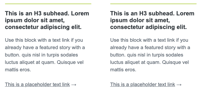
Rich text Block__horizontal
Here is the individual "Rich text Block__horizontal". The rich media can be 6x4 or 16x9 - whichever you choose, just be consistent. Your newsletter will look best if your images have the same aspect ratio and size.
These horizontal rich text blocks can be stacked. Here is an example of this:
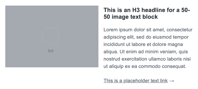
Rich Text Block__2 column with CTA buttons
If your newsletter is NOT using the Featured Media block with the CTA button and you have the need for a call to acdtion-- this block can be used instead-- with 1- or 2 buttons. The same guidelines apply to the images:
- Make sure your images are the same aspect ratio and size.
- Make sure both columns have an image.
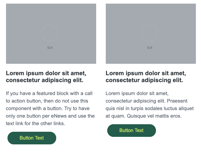
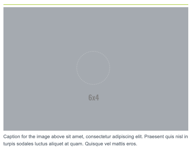
Image with Caption
Single image with caption. These are stackable.
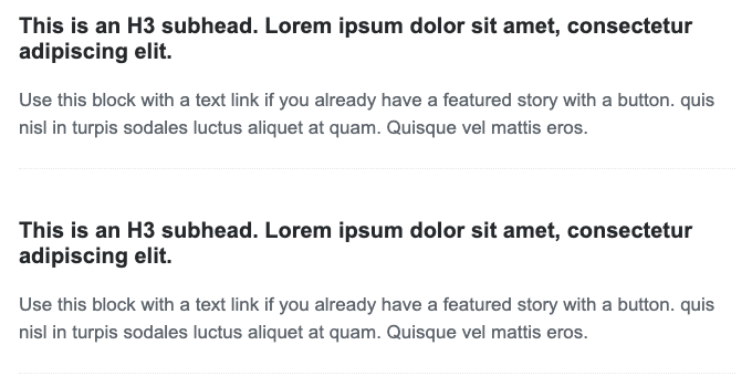
Text__Head and body
This block does not use an image. You can insert hyperlinks. You should have a headline and secondary content. These are stackable.
These "head and body" content blocks can be stacked. The bottom border rule will keep them stackable but discreet.
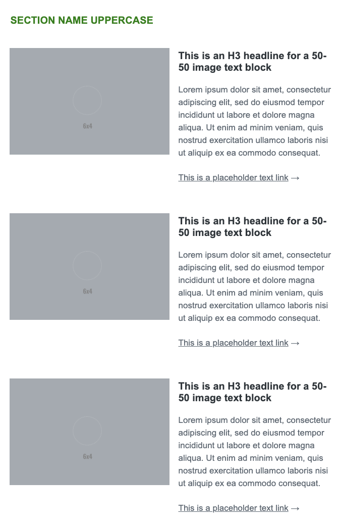
Text__Section Name
The section name is used to punctuate and give context to a group of content in your newsletter. It also creates a sort of visual divider.

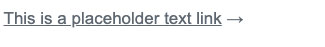
Text__Text link with arrow
This is a secondary link - with a button being a primary link. As stated above, the button should only be used once - at most 2x - per newsletter. All other links that are not contextual links can use the "text with arrow" link block.
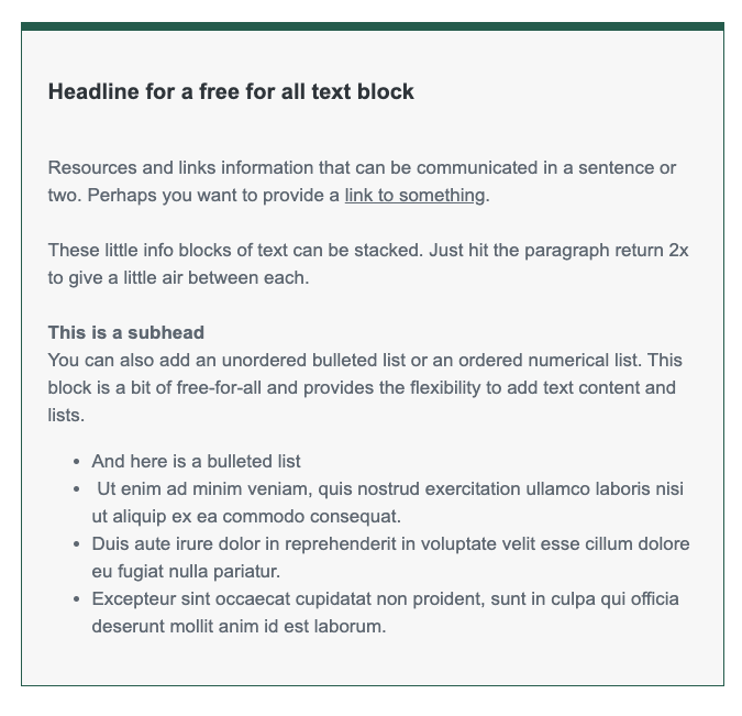
Text box__with dark green border
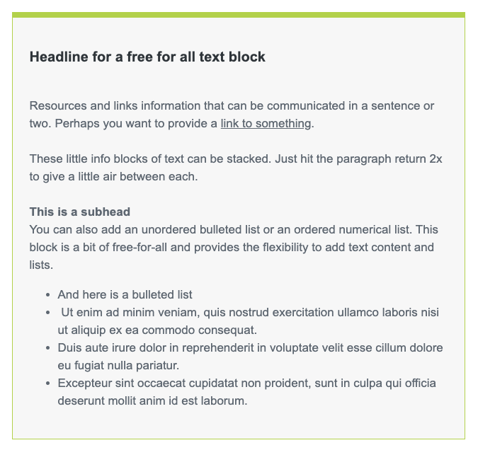
This is a call-out text block - it's a free for all. You can use it for a list of links, for an event announcement- or content you want to present separately from the rest of the newsletter text. It is available with either a dark green or light green border- your choice.
Text box__ with light green border
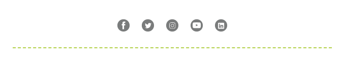
SOCIAL
Social Follow__UVM default links
This is our Social bar- each icon links to UVM's primary social property for each platform.
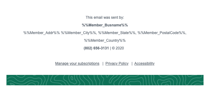
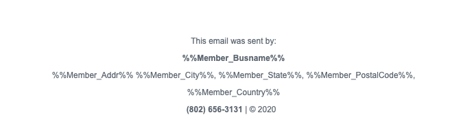
FOOTER ELEMENTS
These are the component that make up the footer of the e-Newsletter. They should not be edited as they have both content and functionality that are mandatory to be in accordance with the CAN spam act. We are just displaying these here as reference.
Footer__UVM default legal footer
Footer__CAN spam compliance

Footer__Topo pattern band

Full combined footer