
Getting Started with the Block Editor
Most KB editors will be familiar with this Classic Editor interface:

At some point in the future, compatibility between the various plugins used by the Knowledge Base may require a transition to the Block Editor interface.
Fortunately, it isn’t functionally that different from the Classic Editor interface. You can test the Block Editor by selecting Switch to Block Editor from the right side menu, or by choosing the Edit (block editor) option when viewing Knowledge Base -> All Articles from the left-side menu.
Thanks for contributing to the ETS Knowledge Base.
Conventions: Styling, Naming, etc.
Proper and consistent style and naming conventions are critical not only for user experience, but also for the effectiveness of the KB-search feature and SEO.
What Should Be Documented
- Document the Best way – don’t document every way
- Don’t document something that’s already documented well elsewhere – point to reputable documentation instead
- Exception: if there are significant UVM-specific aspects of the process
Writing Voice and Tone
- Use you when referring to the reader.
- Avoid using We as the author. Instead, use a passive voice, for example, It is recommended…
- Avoid jargon or technical language
- In cases where this is unavoidable, try to link to resources with explanations of the jargon.
Article Titling
Article titles should be concise, clear, and accurately represent the contained content. Try to avoid multi-line titles, and strip superfluous language where possible.
For example, Accessing Network Folders” is a much better title than “How to connect to the Shared, My Docs, Netfiles, and Zoo Network Folders“.
In cases where a major UVM service or software has several associated articles, such as Brightspace or Microsoft Teams, find and use a consistent prefix, for example, “Brightspace -” or “Microsoft Teams -”
An article’s title is used to create the guide’s URL, so it’s important to have a well-considered title from the beginning. You can still rename an article and manually change it’s URL to a different URL not currently in use.
If you do change a URL, the article’s previous URLs will continue to point to the same article until they are re-used.
Numbered and Bulleted Lists
Concrete, sequential steps should use ordered/numbered lists. A user should be able to to follow each step to complete the desired task or process.
Unordered/bulleted lists should be used when order doesn’t matter, like when you’re describing service features or recommendations.
Best Practices for Lists (and an Unordered/Bulleted List Example!)
- Edit text down to only what is needed
- Use specific wording, identical to the actual options or text(More Info…).
- Use appropriate, consistent punctuation
Ordered/Numbered List Example
Requesting your official transcript through MyUVM:
- Visit MyUVM and sign in with your NetID and password.
- Under the Registrar tab, find the section marked Academic Records and select Request your official transcript.
- Click Mail or Email depending on your desired delivery method.
Formatting Phone Numbers
- Always include the area code for mobile or out of state users
- Phone Number Formatting should generally be the following: (802) 656-2604
Buttons and Hyperlinks
Formatting Hyperlinks
- If your sentences is similar to “Click here to complete the form“, or “Visit this page for more information“, the entire sentence should be hyperlinked.
- Do your best to keep these hyperlinked sentences concise and descriptive.
- References to specific services, supplemental KB articles, and other resources may hyperlink specific relevant words.
- Try to hyperlink several words, rather than only one word. This improves visibility of that link.
Creating Button Hyperlinks
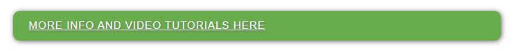
In some cases, it can be useful to have an obvious button, front-and-center on a KB guide. For example, this is the button on the Panon Self-Service Access article:
Creating this button requires some basic editing of your guide in the Text section, as this theme does not include a gui-based method of creating them.
- Click Text in the top right corner
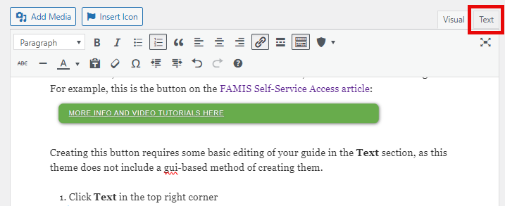
- Copy and paste the following into the spot where your button will appear
<p class="button-kb"><a href="https://www.path.tld">Button Text</a></p>
- Edit the link as necessary, making sure to test that it directs appropriately.
Categories & Tags
Categories
Categories are the high-level organization for the KB, and are visible on the main Knowledge Base page.
Each article must have at least one category assigned to it, but can be assigned multiple, if appropriate. If a user selects one of the Help Topics from the KB main page, they will see a listing of all articles associated with that category.
Tags
Tags are required and are highly recommended for the KB search to be effective, as well as for search engine optimization.
Rules and recommendations:
- Use, but don’t overuse tags
- Use simple, concise names (Assignment only, not assignment tool, etc.)
- Don’t use tags to specify author or department
- Use vendor names where appropriate ( Nintendo vs. Wii U)
- Use proper names for products, even if it’s in the title (Outlook, etc.)
- Use College abbreviations (LCOM) with spelled out names when appropriate (Larner)
- Use Title Case for Tags (Cache, Browser Cache)
- Use spaces in multi-word tags, not dashes or underscores
Toggles, Messages, Tabs, & Accordions
This guide refers to short codes used by the KnowAll KB theme. You can read more about Hero Short Codes here.
Toggles
Toggles are an organizational device and should be used in nearly every article, except in cases where the article scope is exceedingly small. Using toggles to condense information enables an article to contain a lot of content without appearing bloated. Users can skip over toggles that are not relevant to them.
In the majority of cases, a toggle should contain all the steps needed to complete a given task – even when some of those steps are redundant with other sections of the guide.
Examples of common uses:
- Connecting to UVM Wireless – toggles for a variety of operating systems and device types
- Clearing Browser Cache – toggles for common browsers
- BitLocker Encryption – toggles for distinct processes
It is not possible to have a toggle within a toggle (nested toggle).
Messages
Messages offer an effective way to draw a reader’s attention to important information. They should be used sparingly and should never be overly packed with information. Notes should always show the icon and have the title filled.
It is not possible to nest toggles within a message, but it is possible to put messages in a toggle (as is the case here!).
Accordions & Tabs
While a Toggle is a single, self-contained set of instructions or processes, accordions and tabs are a way of organizing like-content into a single entity. The most notable feature of accordions and tabs is that they always have one section expanded.
You can see an example of an accordion in the Duo MFA guide. Tabs are very similar to accordions, except the subsections are located at the top instead of the sides.
Here’s why you should avoid Accordions and Tabs…
Below is the default text organization of an accordion (without [] brackets). Tabs are very similar, but have a different ht_ tag.
ht_accordion sections=”2″ section_head_1=’Section Head’ section_content_1=’Section Content’ section_head_2=’Section Head’ section_content_2=’Section Content’ id=”” class=”” style=””
- Tedious and confusing to add new sections.
- You must add incremental section_head and section_content fields, as well as increment the count of sections. For longer accordions and tabs, this can be complex and lead to hard-to-find errors.
- Fields must be encapsulated by quotes/commas.
- If you ever quote your text (i.e. Click “More Options”), you have to swap the encapsulating characters from quotes to commas.
- Vice-versa if you ever use commas (i.e. UVM’s Admissions department)
- It’s a big block of text, which can be difficult to parse or troubleshoot when creating content.
Just don’t use them. Use toggles instead.
Images & Screenshots
Screenshot Shortcut
- macOS Screenshot Shortcut Keys
- Option + Shift + 4 (+ spacebar to screenshot a window instead)
- More Info: https://support.apple.com/en-us/HT201361
- Windows Screenshot Shortcut Keys:
- Windows Key () + Shift + S
- More Info (general shortcut keys): https://support.microsoft.com/en-us/help/12445/windows-keyboard-shortcuts
Screenshot Editing Recommendations
A screenshot is a valuable enhancement to each article, especially for users who follow instructions better when seen than when read. Screenshots also provide useful context for support staff or for users who are lost on the wrong page.
Display relevant steps and context:
A screenshot should display the step or section, alongside any context critical for the user to proceed through that step or section. It may also be relevant to include some visual context to help the user to see that they are on the right track.
Don’t show the entire window – crop it down:
If possible, you should cut-out unnecessary space in your screenshots. You can also try to reduce the size of the application or browser window to reduce the need to cut-out sections or limit blank space.

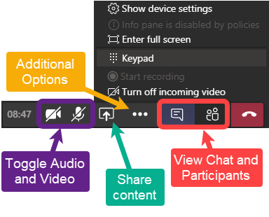
Use screenshot adornments:
Put a box around key buttons or menus to draw a user’s eye. Use an arrow to point a user to the next step. If you use multiple arrows, make sure they show a flow from one step to the next.
More complicated instructions or interfaces may require additional adornment to ensure users don’t get lost or make the wrong selection. 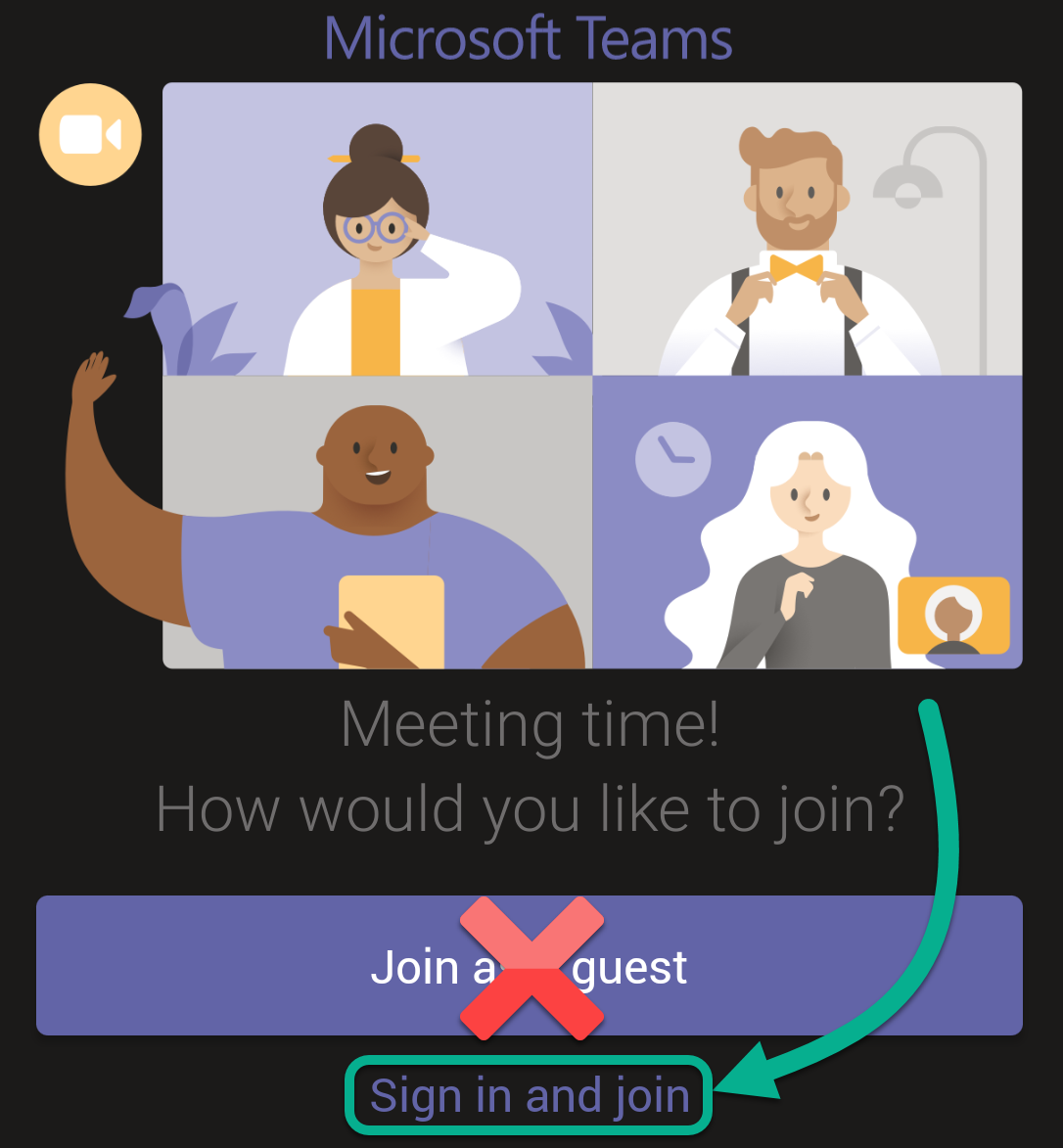
Remember – screenshots are supplemental to written instruction:
It may be tempting to only include your step-by-step instructions in the screenshot, but that affects the accessibility and usability of a guide. It’s crucial that Knowledge Base guides are accessible, catering to a variety of users. The more effective a guide, the more a user is able to self-help, and the fewer support requests to IT and support teams.
If you do choose to include text instructions in your screenshot, please ensure that text is also written explicitly in the guide.
Additional Screenshot Examples
Please view the section above on Screenshot Editing Recommendations for several screenshot examples. This section has more specialized examples that may still be useful.
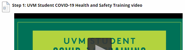
Screenshots that contain Video Links
When documenting a process that includes screenshots of a video, avoid displaying the entire playback image. This avoids understandable user claims that the video is not working.
Uploading your Image
With your adequately annotated and cropped image prepared, you can now upload it.
The Simple Method:
- Position the cursor in the content – click the place in the guide where you want the image to go.
- Drag-drop the image file into the WordPress window.
- The image should upload and be selected. Click Insert into page.
After your image has been uploaded, you can edit the image options by clicking on the image, then clicking the pencil icon.
- Add Media dialog box Options
- Title: A short text description of the image
- Caption: Not required unless your design supports the display of image captions
- Alt Text: Text describing the image’s purpose
- Description: Usually not required
- Alignment: As required.
- None usually works better when the image is positioned on a blank line (paragraph).
- Left and Right work best when the image is being positioned with text or headings. The available text will wrap around the image automatically.
- Center is often avoided. The reasoning for this is noted lower in this guide in the section on positioning images.
- Link To: Leave as Media File.
- This ensure the WP Featherlight lightbox plugin functions correctly. Read more about the plugin below.
- URL: This should be dynamically set based on the Link To field.
- Size: Choose as required. If the sizes displayed are not appropriate for your design and layout, you may need to speak with your web designer. If the image is too large for the containing element, this may cause the layout to break.
Editing an Existing Image
If you wish to edit the options for your image, click the image once and then click the ‘Edit’ button (pencil icon) which appears. Alignment options can also be changed quickly here. There’s also a button to delete an image (displaying a cross).
- Add Media dialog box Options
- Title: A short text description of the image
- Caption: Not required unless your design supports the display of image captions
- Alt Text: Usually the same as the title
- Description: Usually not required
- Alignment: As required.
- None usually works better when the image is positioned on a blank line (paragraph).
- Left and Right work best when the image is being positioned with text or headings. The available text will wrap around the image automatically.
- Center is often avoided. The reasoning for this is noted lower in this guide in the section on positioning images.
- Link To: Leave as Media File.
- This ensure the WP Featherlight lightbox plugin functions correctly. Read more about the plugin below.
- URL: This should be dynamically set based on the Link To field.
- Size: Choose as required. If the sizes displayed are not appropriate for your design and layout, you may need to speak with your web designer. If the image is too large for the containing element, this may cause the layout to break.
The Media Library
All the images uploaded to your website can be viewed and edited in the Media Library. Click Media in the left hand navigation menu of the dashboard to view them.
Plugins & Theme
Better Font Awesome
The FontAwesome plugin can be used to insert logos and other helpful graphics into your content.
The Insert Icon button on the editor toolbar displays all available FontAwesome icons. This list is searchable.
Here are some of the common icons you may use:
Contact Form 7
We use contact forms in a few places on the KB – the most notable being the form for Submitting a Help Ticket.
Copy Anything to Clipboard
This plugin makes makes it so you can surround text with <pre> tags, creating a box that people can copy text from.
Here's an example!
Relavanssi
This plugin improves the KB’s search capabilities, allowing for various weighting based on the article’s title, categories, tags, content, and metadata.
User Role Editor
This plugin gives site administrators greater control over the many roles and associated rights of Knowledge Base editors, authors, or subscribers.
WP Featherlight
This is a lightbox plugin, opening the image in full screen at 100% it’s upload size, and dimming the rest of the web page. Click the image below for an example. 
Custom Function: Linking to an Auto-Expanded Section in an Article
You can direct someone to a specific section in an article using hash codes. A hash code is simply the id of a given article section.
For example, click this hyperlink to view the section in the Microsoft Teams guide on clearing the Teams cache on Windows. It will open a new page with the following URL – the id is bolded: https://www.uvm.edu/it/kb/article/teams/#windows-teams-cache-i-cant-log-into-teams-after-i-changed-my-netid-password.
Notably, the toggle is already opened when clicking the link above. You can also automatically expand all toggles in a page by using the #all hashcode.