
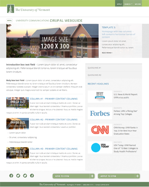
 You may need all new images and/or sizes for your transition into Drupal. We have marked on the templates what these image sizes will be so that you can begin finding new images or resizing old favorites. We always suggest that you consult the
 Sizing photos for your chosen Drupal template
Whenever you have an opportunity to upload images in Drupal, you will see a blue TIP alerting you to the image size appropriate for the space. The best way to plan for this is:
- Plan for your homepage content which will help you decide which template to choose.
- Once you have chosen the page templates, you will see the image sizes in the Drupal interface. Size/crop accordingly.
- Plan for the content within your website and let that content guide you toward the best interior template choices (ie: "I only have some basic content with an image and a number of important links I need to link to" or "I have a number of images and content featuring our unit's research").
- Once you have chosen the page templates, you will see the image sizes in the Drupal interface. Size/crop accordingly.
Tips and guidelines for successful photos
DO:
- Select photos with context, “in the moment.”
- Take time to edit and size your photos. (Free or low cost online photo editors Pixlr, iPiccy, PicMonkey or Sumopaint.)
- Select, compose and edit photos optimally for your banner image(s).
- Compose and insert concise and clear alternative (ALT) text for your images when appropriate. (Tips for creating good ALT text.)
- Properly sized photo to use on your social media channel (Download University branded social media icons)
DON'T:
- Use group shots of people unless you can tighten in on the photo.
- Use your website as a way to highlight your tastes in photos. Go for what's most professional for the department.
- Be afraid to crop. Most people never crop tight enough or are afraid to crop tops of heads — a trick that works well when cropping headshots.
Filenaming Protocol
 Filenames and folders cannot have spaces! Use camelCaseNaming, hyphens or underscores if you need visual separation in your filename.
IMPORTANT! Filenames and folders cannot have spaces. Make sure you name your files with either camelCaseNaming or with hyphens or underscores. use-hyphens_or_underscores.
Responsive Images
When adding images to a text block — to ensure they stay responsive and mobile friendly:
In order to get an image that scales in any field:
- Make sure to use a properly sized image.
- Set the width to 100%.
- Don't use height — even if the text editor adds it, it's best to remove it.
In order to constraing the size in the main body:
Constraining size in the large body of text can require more work. The best practice is the following:
- In a style parameter set the width to 100%
- Remove any trace of height.
- Set the max-width equal to the largest with display you want the image to show at
For example, if you want an image that is 512px wide at full size, add
style="width:100%; max-with:512px" this will allow your image to scale on small screens
without having to be tiny on large screens.
Full code example:
<img src="/path/myimage.png" style="width:100%; max-with:512px" />
 View some examples and read the latest photography style guidelines (PDF).