General Accessibility Guidelines for Documents
A Basic Accessible Document Checklist
Meaningful images have meaningful alt-text
Documents should have nested headings (H1 > H2 > H3 > H4 > H5) not just bolded text
Document has only one H1, and that’s the title
Check color contrast between text and background. 3:1 for large text, 4.5:1 for regular size text.
Don’t use images of text without all the text appearing elsewhere
No empty links (Avoid “Click here!”)
Give your document a unique and meaningful title
Explicitly set your document language
Choose meaningful file names with no spaces
Include bookmarks or a table of contents for documents 7 pages or longer
Run the automated accessibility checker, if one is available
Let's look, step-by-step, at how to accomplish each of the items on this list. You can also download this checklist as a .pdf, if it would be helpful to print out as a reference.
Step-by-Step Instructions for Accessible Documents
Meaningful images have meaningful alt-text
"Alt-text" stands for "alternative text". This means that when someone cannot access an image, either because of a visual disability or simply navigating with the images turned off, they're given an alternative version of the information in the form of text. Selectable text is the most accessible form of information in digital products.
How To Create Alt-Text in Microsoft Office Documents
All Microsoft Office documents -- Word, PowerPoint, or Excel -- offer the option to add alt-text to images.
In Microsoft Word, PowerPoint, or Excel, the process is the same: right-click on the image, and choose "View Alt-Text..." This will open up the alt-text editor on the right-hand side of your document. Enter your alt-text in the empty box, then save your document.
How to Create Alt-Text in .PDF Documents
You can add alt-text to images in .PDF documents most easily in the source document -- that is, the document that was originally used to create the .PDF. This could be a Microsoft Office, InDesign, or Canva.
If you need to fix, or remediate, a .PDF to add alt-text, open up Adobe Acrobat Pro, and choose "Prepare for Accessibility". Then choose "Add alternate text". This will open up the alt-text editor in Adobe Acrobat Pro.
When Not To Add Alt-Text: Meaningful vs. Decorative Images
Add alt-text to every meaningful image in your document. A meaningful image is any image that contributes to a reader's understanding of the content of the document. Examples of meaningful images include:
- Illustrations
- Maps
- Charts
- Event Photos
Other images, such as section separators, chapter decorations, are just included for decoration. They don't contribute to the meaning of the document, so you can mark them as "decorative". When an image is marked as decorative, assistive technology, such as screen readers, will not try to interpret the image.
In Microsoft and Adobe Acrobat Pro, there is an option to mark an image as decorative underneath where you can add alt-text.
Documents should have nested headings
Every document needs headings. Headings help people who are using assistive technology navigate and skim a document. Headings mark the beginnings of large pieces of content, like chapters or sections, begin.
You need to add headings to your document using your software's Styles function. When you simply bold and use large text to create headings, those headings are only different from regular text visually; for assistive technology, they don't provide an outline for a document.
How to Add Headings in Microsoft Office
In Microsoft Word, PowerPoint, or Excel, navigate to the Home ribbon, and choose "Styles pane". This will open up the Styles pane on the righthand side of your document. As you add headings to your document, choose a style from the Styles pane. To do this, highlight the text of the heading, and then click on the heading level you need.
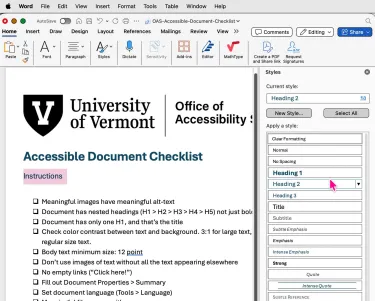
Headings Must Be Nested
In order for a document to work correctly with assistive technology, headings must be set up using the Styles pane, and they must be nested. Correctly nested styles go from one level directly to the heading level below without skipping levels.
For example, a chapter of your document may begin with a Heading 2. A sub-section of the chapter would then begin with Heading 3 -- not Heading 5 or Heading 6.
After that, a subsection of your Heading 3 section would begin with Heading 4. And so on.
It may be helpful to think of correctly nested headings as matryoshka dolls, the traditional painted wooden dolls that fit one inside the other. The dolls only nest together in one order: with each next smallest doll directly inside the larger.

Every document has one, and only one H1, and that’s the title
As you're adding headings to your document, know that every document needs to have one -- and only one -- Heading 1, or H1 heading. Use Heading 1 for the title of your document. Do not use the "Title" heading for your document. This is screen readers are written to look for Heading 1, and they are not written to look for Title heading styles.
Do not use Heading 1 for anything in your document other than the title of the document.
Check color contrast between text and background.
Inadequate color contrast between text and its background is the most common accessibility error on the internet (WebAIM "Million" Survey, 2026). Poor color contrast makes it difficult for people with a variety of visual disabilities to read your document.
How to Check Color Contrast
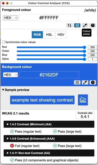
First, choose a color contrast checker. The UVM Office of Accessibility Services recommends either TPGi's Colour Contrast Analyser, or WebAIM's Online Color Contrast Checker. Both are free, and both are frequently used by accessibility auditors. TPGi is software available for Mac or Windows that you download and install on your machine. WebAIM's Online Color Contrast Checker is based in a web browser.
How to Use TPGi's Colour Contrast Analyser
- Click the foreground eyedropper and click on your text or icon.
- Click the background eyedropper and click the color directly behind the text.
- Check the calculated ratio at the bottom: aim for at least 4.5:1 for regular text and 3:1 for large text or graphical controls. This tool automatically shows if you pass WCAG 2.1 AA-level or AAA-level standards. It uses the word "Pass" with a green checkmark if the combination passes; it uses the word "Fail" with a red X in a circle if the combination is not strong enough.
How to Use WebAIM's Online Color Contrast Checker
- Open the tool: Go to the WebAIM Contrast Checker page.
- Input foreground color: Type your text's hexadecimal code (Hex) into the Foreground Color box, or click the color block and use the eyedropper icon to pick the color directly from your screen.
- Input background color: Type the background Hex code into the Background Color box, or use the second eyedropper tool to select the background color.
- Review the contrast ratio: Check the calculated contrast ratio number displayed by the tool (for example, 4.5:1 or higher).
- Check pass/fail results: Look at the WCAG compliance section to see if your colors Pass or Fail for normal text, large text, and graphical components under AA and AAA standards.
Regular Text vs. Large Text: How To Measure
While the Web Content Accessibility Guidelines (WCAG) don't have specific font size guidelines, UVM advises you to use the following guidelines for regular text vs large text:
- Regular (Normal) Text: Any text that does not meet the threshold for large text. Standard body text is typically recommended to be at least 16px (12pt) for general readability. Regular text must have a contrast ratio of 4.5: 1 to meet color contrast minimums for AA-level accessibility.
- Large Text: Defined as 18 point (approximately 24 pixels) or larger, or 14 point (approx. 18.66 pixels) and bold or larger. Large text must have a contrast ratio of 3:1 to meet color contrast minimums for AAA-level accessibility.
An Important Note About the Microsoft Office Accessibility Assistant:
At this time, Fall 2026, there is a known bug in the Microsoft Office Accessibility Assistant where the automated tool fails to correctly identify color contrast issues in documents. OAS strongly advises that you use one of the color contrast tools listed here
Don’t use images of text without all the text appearing elsewhere
Images of text are any .jpg, .png, .tiff, or .eps that contains text. If you add an image to your document that contains text, that text cannot be read by assistive technology. This means that you have to reproduce all that text as plain text in the document. Plain text in a document is anything you can select with a mouse or instruct a screen reader to read aloud to you. It is anything you can highlight and translate, or copy and paste.
Charts and Graphs
Charts, graphs, and maps generally contain a lot of text. UVM advises you to use a tool such as Datawrapper.de to create interactive, customizable charts and graphs that you can embed in documents, and that users can customize.
You can embed Datawrapper charts in documents, websites, and presentations using interactive links, static images, or specialized add-ins.
Datawrapper Embedding Options for Documents
- PowerPoint: Use the official Datawrapper PowerPoint add-in to add static or editable charts straight into slides.
- Word and Google Docs: Copy the "Visualization only" URL or download the chart as an image (PNG or PDF) to insert it as a static graphic.
Scientific Equations
Equations such as those found in mathematics, statistics, chemistry, physics, and other sciences are difficult to make accessible when they are saved as images. UVM recommends that you use an accessible equation editor to create your equations, rather than creating them as images.
- In Microsoft Office applications, you can use MathType to create accessible equations.
- In Brightspace, you can use the default Brightspace equation editor to create accessible equations.
No empty links (Avoid “Click here!”)
To be accessible, links in your documents must do three things:
- The link text must indicate the content of the destination
- The link text must indicate the format of the destination
- The link must be large enough to be operable for people with disabilities
Links Must Indicate the Content of the Destination
Link text must make it clear to the reader where the link goes to. A link that simply reads "Click here" gives a reader no idea where they will go if they click the link. Instead, use the title of the destination webpage or destination document as the text of your link.
For example, if you are creating a course syllabus that links out to readings:
- DO NOT: "Click here for the first reading"
- INSTEAD DO THIS: "The first reading in the course will be Professor Anybody's article in the Anything, Anywhere journal, "This article is clearly an example".
Also, remember: not everyone uses devices that click.
Links Must Indicate the Format of the Destination
Link text must make it clear to the reader if the link they are clicking is anything other than an HTML link. If you are linking to anything other than an HTML page, include the format of the destination in parentheses after the link.
- Watch this video on creating accessible links: "How To Write Accessible Links" (video)
- Download the Office of Accessibility Services' full checklist for document accessibility (.pdf)
- The full checklist for document accessibility is also available as a Word document (.docx)
Other format destinations include: .mp4 (for downloading videos), .mp3 (for downloading audio), .xlsx (for downloading spreadsheets).
The Link Must Be Large Enough to Be Operable
Readers may navigate your documents on anything from a laptop or desktop machine to their television or gaming system, all the way down to a smartphone, Blackberry, or iPod. And many of those readers may have disabilities that affect their hands or fingers. Best practice for setting up accessible links is to make them 3-5 words long, so that people with disabilities don't have to work extra hard to settle their devices on your link.
Give your document a unique and meaningful title
Every document needs a unique and meaningful title. That title should appear in two places: on the first page of the document, and in the metadata of the document itself.
How to Create A Title On The First Page
Using your source application, the application you are editing the document in (Microsoft Office, Adobe InDesign, Brightspace, Google Docs, Canva), type the title of your document. Then highlight the text, and use the Styles pane or dialogue box to set that text to have the Style of Heading 1. It is the only text in your document that will have Heading 1.
(Microsoft Excel will have different instructions.)
How to Put Your Title In A Document's Metadata
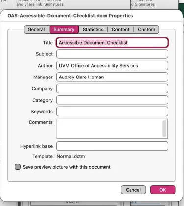
In Microsoft Office: go to File > Properties (Mac) or File > Info (Windows). Fill out the Summary with a Title (the title of your document), the Author (your department), and the Manager (your name).
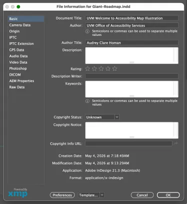
In Adobe InDesign: go to File > File Info... > Basic. Fill out the Document Title (the title of your document), Author (your department), and Author Title (your name).
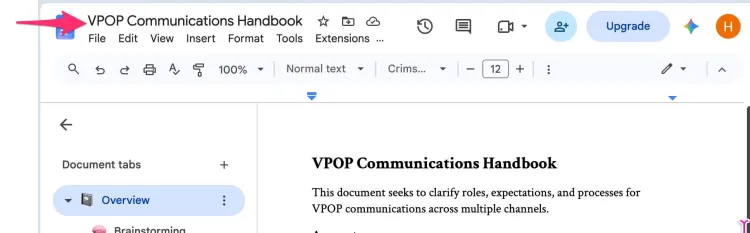
In Google Docs: all you have to do for the title is title the document in the title bar, with what will also be used as the file name.
In Canva: To set a file name in the metadata of a Canva file, you need to change the design title inside the Canva editor. Canva automatically injects your project's title into the exported file's structural metadata (EXIF/IPTC header fields) and matches it to the downloaded filename.
Explicitly set your document language
Assistive technology, including screen readers, depends on knowing which language a document is written in before it starts attempting to interact with the document. This is because every language has its own set of rules, including where to find verbs and nouns in a sentence, how to interpret diacritic marks, and which way to read a sentence: left to right, right to left, or top to bottom. If assistive technology doesn't know which set of rules to apply, the user may not be able to use your document.
For documents written in multiple languages, set your document's language to the main language used in the document. For the pieces in other languages, highlight each piece of text and use the following instructions to set the language for each individual language that appears in the document.
How To Set Your Document's Language
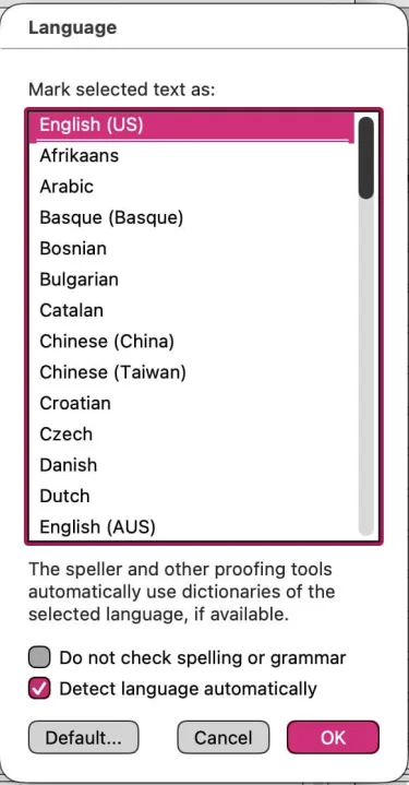
In Microsoft Office: Under the Tools menu, go to Language, and choose the language that the document is written in. Then choose "OK".
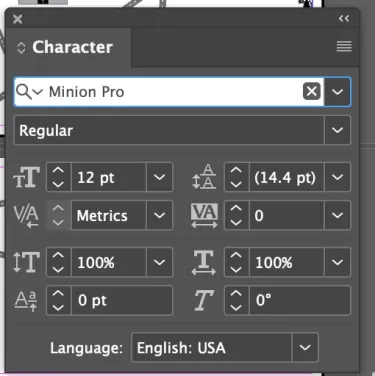
Adobe InDesign: Go to Window > Type & Tables > Character to open the Character panel. Choose your preferred language from the Language drop-down menu.
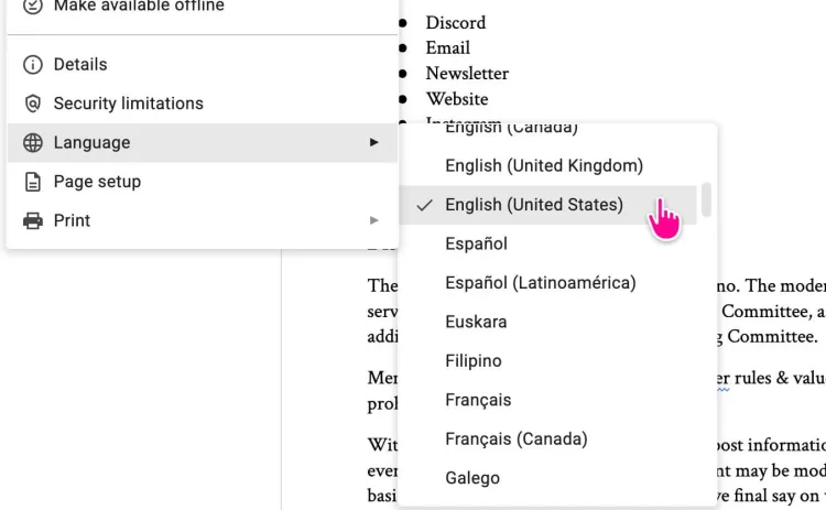
Google Docs: Go to File > Language, and choose the main language of the document.
Choose meaningful file names with no spaces
Meaningful file names help people with disabilities and people without disabilities. It's easier to remember a file name that uses natural language in the title, for instance, than to remember a file name filled with dates and version details. But file names are also used by assistive technology users locate, open, and manipulate files.
To create accessible file names:
- Use natural language terms instead of version numbers or dates
- Avoid using spaces in your file name. Instead use dashes or underscores between words
- If you're including a date in your file name, use the universal format, instead of a format specific to any one country. The universal format is YYYY-MM-DD. This will create a date format that adapts to the country of the assistive technology user.
Include bookmarks or a table of contents for documents 7 pages or longer
Navigation links make it easier for people using assistive technology to move about and find things inside long documents. They're also very helpful for people who aren't using assistive technology as well.
- Choose to include a Table of Contents, using the source application's Table of Contents tool, if you're creating a document in Microsoft Word, or Adobe InDesign.
- Microsoft PowerPoint files automatically create a navigation schema based on the title of each slide.
- For Microsoft Excel files, if the workbook has three or more worksheets, create an Index sheet, titled "Index". This sheet should contain a description of the workbook, as well as links to the A1 cell of each sheet in the workbook. In the A1 cell of each sheet after the index, write a brief description of the data in the sheet, along with noting where the actual data starts in the sheet.
Run the automated accessibility checker, if one is available.
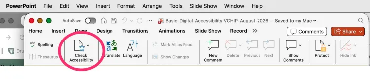
The Microsoft Office suite includes an automated accessibility checker, known as the Microsoft Accessibility Assistant. To open it in Word, PowerPoint, or Excel, go to the Review ribbon, and choose "Check Accessibility".
This will open up the Microsoft Accessibility Assistant in the righthand side of your document. Follow the instructions the Accessibility Assistant gives you to resolve accessibility errors. These could look like missing alt-text, needing to properly nest headings, or to set the language of your document.
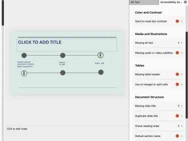
If you choose any listing in the Accessibility Assistant that shows a number instead of a checkmark, Microsoft will guide you through where to find each error and how to fix it.