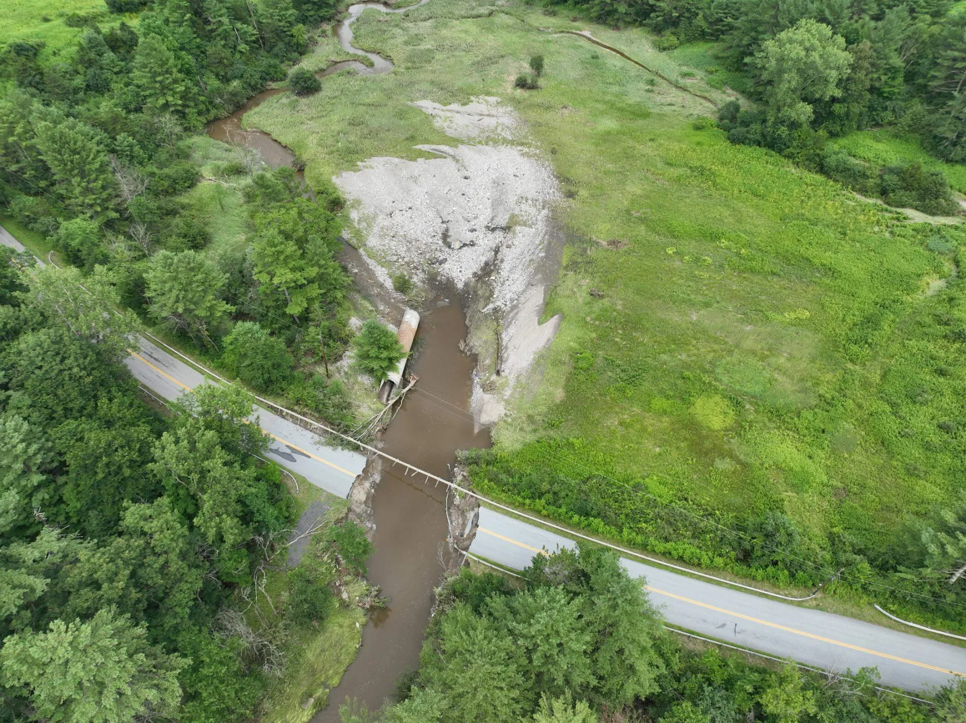
Over the past decade, Vermont has experienced an increasing frequency of flooding events. These damaging floods deliver colossal amounts of rain, destroying buildings, and devastating communities in their wake. During the July 2023 flooding events, two months’ worth of rain fell in just 48 hours, causing upwards of $600 million in damages across the state.
The increasing frequency and intensity of these extreme events calls for tools that support decision-makers in improving their flood response actions.
A new study by UVM researchers in the Rubenstein School for the Environment and Natural Resources and University of Minnesota’s Institute on the Environment sought to compare real-time flood inundation mapping services, with a goal of improving their accessibility, interpretability, and effectiveness as decision support tools.
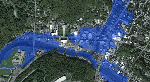
Flood Inundation Maps, or FIMs, provide information on current, future, historical, and hypothetical flooding in river systems. FIMs communicate these hazards through visualizations, using colors and symbols to display where flooding occurs within a landscape. These outputs are key in not only aiding extreme weather response planning and informing evacuation decisions, but also long-term planning and infrastructure design.
Unlike conventional flood forecasts that display discharge and water height related to United States Geological Survey (USGS) gauges, FIMs show exactly where flooding is happening, or where it will likely happen, even without prediction points nearby. These maps are powerful tools and can assist in decision-making that can prevent the loss of life and property. However, the outputs are not easily interpreted by decision-makers and the public.
Supported by the Cooperative Institute for Research to Operations in Hydrology (CIROH), the Watershed Lab at UVM, led by Dr. Anne Jefferson, analyzed common visualization challenges and developed recommendations to improve the usability of FIM services available online for both technical and non-technical users.
Design choices in FIM outputs, such as color, shapes, icons, and symbols, significantly influence what information users retain, and how quickly and effectively they process and interpret the results. This research combines cognitive psychology, risk communication, and decision science principles to determine the most effective ways of improving flood forecast visuals for all users.
To carry out this study published in the journal, Hydrological Processes, eight FIMs were identified based on consultations with the NOAA Office of Water Prediction, representing diverse geographies, organizations, and visualization approaches. Each FIM was then analyzed against a series of criteria relating to their flood and hydrological information, as well as their interface and how it was navigated.
The team’s goal was to evaluate how FIM visualizations aid or impede users’ understanding of flood risk and to advise designs that are more comprehensible for all audiences, regardless of technical expertise in hydrological forecasting.
The researchers developed a set of task-based questions to assess the challenges of understanding the FIMs. Respondents were provided with FIM visuals, along with the questionnaire, and were asked to describe the challenges and strengths of interpreting the designs.
The results of the study revealed that common visualizations on FIM outputs inhibited users’ ability to quickly and effectively interpret the maps. The symbology and colors used to indicate areas of critical flood risk were unintentionally hidden compared to those representing areas with “no flooding.”
Additionally, redundant and conflicting use of color, as well as commonly used symbology, reduced visual clarity. Technical jargon, vague or missing labels, and a convoluted interface layout and layer system undermined readers’ ability to accurately interpret flood risk. However, the study also identified strengths of the designs, including the presence of public health information, that researchers can use to advise future layouts.
This research determined strengths and weaknesses that are key to improving the clarity of FIMs. These findings were used to build a list of five key design recommendations that integrate the results above and optimize how readers understand and interpret the information presented.
As major floods become more frequent and severe, it is increasingly important that FIM users, including emergency managers, municipal officials, and community members, have access to clear and well-designed flood maps. This study’s recommendations will improve FIM design, strengthening their role in guiding critical decisions that protect communities from dangerous flooding.
The researchers are following up this diagnosis by continuing to work with NOAA to complete testing of alternate visualizations that might improve the speed and accuracy of FIM interpretations.