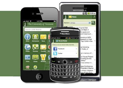
UVM is now more accessible on your mobile device with the launch of m.uvm.edu.* This launch comes months after the launch of iUVM, the iPhone app for uvm.edu.
It's true that uvm.edu has always been viewable on smart phones and some might wonder what this mobilization means. Web-enabled smartphone use makes it easy enough to access websites in miniature form, but the true mobilization of a website captures appropriate content in a format that's much more conducive to reading on a handheld device. Regular-sized sites scaled down on a mobile device demand excessive scrolling of small text in order to read the content. True mobile sites optimize appropriate content and bring it to the surface while minimizing keystrokes — content for on-the-go readers.
While some universities offer a mobile friendly interface that links to regular full-size websites, UVM’s mobile site includes some of the main website's most popular content areas such as news, directory and courses — all optimized for mobile. The site also features information of particular interest to mobile users including building information, emergency updates and events.
The site was researched for about a year with development beginning this past May and was built upon the Kurogo framework used by Harvard, MIT and Middlebury College (among others).
“The framework we chose was a good fit with our website infrastructure and allows for rapid deployment — a key to building a successful mobile website,” says Tatjana Salcedo, strategist for the UVM Web Team. She adds that m.uvm.edu is compatible with a huge variety of mobile devices from feature phones to the popular Android and iPhone. It's even optimized for iPad.
Student power was key to the site’s completion. The site’s technical implementation was the summer project of computer science major Ebrahim Kobeissi (Eebs) '12.
"I think it's a very different experience programming for devices other than a computer. You have to consider problems that are outside the scope of normal issues,” says Kobeissi. "And it will be great to be able to reach people who are on the go, and give them a better experience when browsing UVM's website."
Next steps for UVM's mobile site include integrating more content of particular use to mobile users such as dining location schedules, menus and campus shuttle info. There are also future plans to develop mobile apps based on the mobile webiste.
*Viewing note: The mobile site is viewable on a regular Web browser in a larger format; users navigating to www.uvm.edu from mobile devices will be offered a choice of entering the mobile site or going directly to the full "regular" site.