Doing Graphics in R

One of the things that R does best is graphics, but whole books have been written around R graphics and I can't come close to covering the whole field. I will instead cover the basic graphs and present some detail on using low-level functions to improve the appearance and the clarity of a graph.
One of the sometimes confusing things about doing graphics in R is that there are all sorts of different ways of doing so. The basic R package uses something called "graphics." This is the simplest approach, and one that I will generally follow here. It may be simple, but it really will do almost anything you want. Then there are other approaches called things like "lattice", "Trellis", "rpanel", "ggplot2", and others. I will ignore lattice graphics completely. When I have a similar page written for my Statistical Methods for Psychology, 9th ed., I will devote some time to ggplot2, because it really is a super package. But for what we want here, I think that it is overkill.
While I was working on this page I stumbled across a web page by Frank McCown at Harding University. The page is available at http://www.harding.edu/fmccown/r/. I thought that it was particularly helpful, in part because he goes one step at a time. I have to admit that in some ways it is better than mine.
I will use the Add.dat data found on the book's Web site. This file contains data on an attention deficit disorder score, gender, whether the child repeated a grade, IQ, level and grades in English, GPA, and whether the person exhibited social problems or dropped out of school. They came from a study that Hans Huessy and I published way back in 1985. First I need to read in those data and attach them so that I can easily specify the variables I want.
data <- read.table("http://www.uvm.edu/~dhowell/fundamentals9/
    DataFiles/Add.dat", header = TRUE)
attach(data)
The simplest command for plotting the variables is the "plot()" command. I could ask it to plot the whole data frame (data), using "plot(data)", but that would give you a graphic that no mother could love unless it was absolutely needed. (Try it if you like.) Let's work, instead, with only one or two variables. The student's grade point average looks like a good candidate, so let's create a histogram of it. In fact, I will create several histograms to show you different things that I can do.
First I will set up the graphics screen so that I can show four different plots at once. I'm doing that so that I can paste all of them on one figure and save space. To do this I use the "par(mfrow = c(2,2))" command to have two rows and two columns.
The first plot will just be a plain old basic histogram. Nothing fancy. I am more interested here in showing you what R will do and the kinds of elaboration you can add than teaching you specific commands. The commands for plotting a histogram are:
par(mfrow = c(2,2))            # Set up the graphics screen
attach(data)    #if you have not alredy done so
hist(GPA)
#------------------------------------------------------------------------
### Now add some nice labels.
hist(GPA, main = "Grade Point Average", xlab = "GPA in 9th grade",
  density = 10, col = "blue", breaks = 12)
#------------------------------------------------------------------------
### Make it even prettier by changing the ordinate to density
hist(GPA, main = "Grade Point Average", xlab = "GPA in 9th grade",
  density = 10, col = "blue", breaks = 12, probability = TRUE)
#------------------------------------------------------------------------
### And now get overly fancy to show how to add a neat legend and smoothed distribution.
# I know that the mean and variance are 2.45 and 0.74
meanvalue <- expression(paste(bar(x) == 2.45))       # set this up to write out
variance <- expression(s^2 == 0.74)                            # nice text using symbols
legend(1,0.7, c(meanvalue, variance))                        # The first two entries are X and Y coordinates
lines(density(GPA), col = "red")                                    # Fit a "best fitting" curve
#------------------------------------------------------------------------
I'm sure that you could easily figure out how to present those vertical bars in red, how to put in a different mean value, and so on. The "breaks" command specifies how many bars you want. Try changing that and see what happens. One thing that might puzzle you is the vertical axes. For the top two, I have plotted the frequency for each bar. Scores between 2.5 and 3.0 occurred a bit over 25 times., for example. In the bottom two graphs I have plotted density on the Y axis. Think of this as the "relative probability" at which each value occurs. I say more about this in the text.
You might reasonably wonder how a child's GPA is related to his or her IQ. For that we want a scatterplot, with GPA on the Y axis and IQ on the X axis. In the following command you can read "~" as meaning "as a function of." I didn't want some boring old circles or dots to represent the data points, so I set the plot character to 7, which gave me those nice little boxes with an x in them. Try changing to some other value.
But I wanted to add a best fitting line to those points. To get that I had to jump way ahead in the book to calculate a regression line and then plot that line with the "abline() function. You can ignore that if you wish. Finally, I wanted to put the actual correlation on the figure, but I didn't know where there would be space. So I used the "locator" function. It plots the scatterplot and then sits and waits. When I use my cursor to click on a particular open space on the screen, it writes the legend there. That's kind of neat.
plot(GPA ~ IQ, main = "GPA as a Function of IQ", sub = "9th grade data",
 pch = 7)
regress <- lm(GPA ~ IQ)      # So that we can add a regression li
abline(regress)
r <- round(cor(GPA, IQ), digits = 3)
text(locator(1), paste("r = ",r))  #Cursor will change to cross.
                                                       #Click where you want r printed.
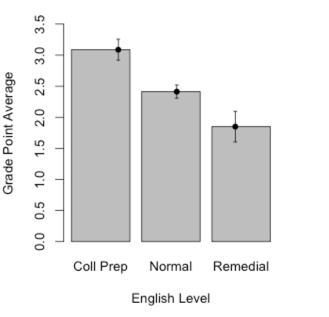
When we have a continuous variable, such as GPA, and a discrete variable, such as EngL (the level of English class the student was in), we would often like to plot one against the other. That is not particularly hard to do. First we want to specify that EngL is a factor, so that R doesn't treat it as continuous. Then we want to make up a table giving the mean GPA, standard deviation, and sample size at each level of EngL. We do both of these things in the code below.
The first half of the code, down through the barplot command, produces a standard bar graph. After that I got a bit fancy. We already know what the sample means are, but this part of the code sets confidence limits on each mean. I don't discuss these until several chapters later, but the code is here if you ever want it in the future. Otherwise you can ignore it. The "tapply" command can be read to say "create a table where GPA is broken down by EngL, and the mean is calculated for each category. (The others calculate the standard deviations and sample sizes.)
### Barplots
library(Hmisc)        # Needed for "errbar()" function
EngL <- factor(EngL)
levels(EngL) <- c("Coll Prep", "Normal", "Remedial")
Grades <- tapply(GPA, EngL, mean)
stdev <- tapply(GPA, EngL, sd)
n <- tapply(GPA, EngL, length)
barplot(height = Grades)
top <- Grades + stdev/sqrt(n)
bottom <- Grades - stdev/sqrt(n)
barplot(Grades, ylim = c(0,3.5), ylab = "Grade Point Average", xlab = "English Level")
errbar(x = c(1,2,3), y = Grades, yplus = top, yminus = bottom, xlab = "English Course
Level", ylab = "Grade Point Average", add = TRUE)
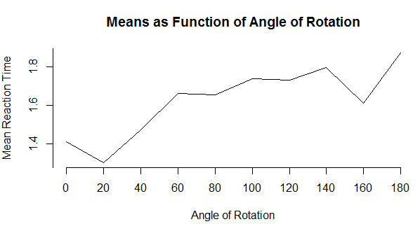
I will start with a very simple line graph and then move on to something more interesting. Line graphs are a very nice way to show how something changes over time or over the levels of another variable. We will use a dataset given early in the book based on an example of identifying rotated characters as a function of the degree of rotation. The code for reading these data is below, but you probably don't want to get too involved in the syntax. (The "tapply" function calculates the mean of RTsec for each level of Angle. From the graph it is clear that as a character is rotated, it takes longer to identify whether or not it is a specific letter. If you just want a very basic line graph, you can simply use the command "plot(means, type = "l"). The rest of the code focuses on making things pretty. (I have a small confession. It took me a lot of work to get this to come out just the way I wanted. You can play with it with a good bit of trial and error. or you can just use the basic plot.)
data <- read.table("http://www.uvm.edu/~dhowell/fundamentals9/DataFiles/Tab3-1.dat",
header = TRUE)
attach(data)
means <- tapply(RTsec, Angle, mean)
     # Mean reaction time for each angle of rotation
print(means)
	0            20             40             60             80            100            120           140           160           180
1.408000 1.298333 1.470833 1.663500 1.655500 1.738833 1.730000 1.796167 1.611500 1.872333
plot(means, main = "Means as Function of Angle of Rotation",
     xlab = "Angle of Rotation", ylab = "Mean Reaction Time",
     type = "l",
     axes = FALSE)
     axis(1, at = 1:10, lab = c("0", "20", "40", "60", "80",
          "100", "120", "140", "160", "180"))
     axis(2, at = c(0, 1.2, 1.4, 1.6, 1.8, 2.0))
Now lets go ahead to something only a bit more advanced. I am going to jump ahead to include what is called an interaction plot. I am doing so because this is a function that I think that you should know about, even if you don't have a use for it until later. The basic idea is that we have a variable (call it score) whose mean changes over conditions. Moreover, the change across conditions varies for different groups. To take a specific example from Chapter 13, Spilich and his students looked at how task performance varied as a function of smoking (non-smokers, delayed smokers, and active smokers). They looked to see if changes due to smoking varied across different tasks. Basically, this is three line plots on the same graph, one for each type of task. These data are found in Sec13-5.dat.
data <- read.table(file.choose(), header = TRUE)
head(data)  #Ignore variable labeled "covar"
  Task Smkgrp score covar
1    1      1     9   107
2    1      1     8   133
3    1      1    12   123
4    1      1    10    94
5    1      1     7    83
6    1      1    10    86

attach(data)
Task <- factor(Task, levels = c(1, 2, 3), labels = c("PattReg","Cognitive", "Driving"))
Smkgrp <- factor(Smkgrp, levels = c(1,2,3), labels =
     c("Nonsmoking", "Delayed", "Active"))
interaction.plot(x.factor = Smkgrp,
     trace.factor = Task,
     response = score,
     fun = mean)

I have spent a lot of time figuring out the easiest way to add mathematical symbols to text and to include either a predefined value of some variable or the value that the program has just calculated. So you are going to have to either put up with a section on how to do that or else skip it. At least it is here if you need it. You certainly don't need it now.
To add math symbols you need to use a function like "expression", "substitute", "bquote", and others. I hate to say it, but these are not described well in any source that I have seen, especially in the help menus. (I get them to work mainly by trial-and-error or by copying what someone else did--and many of those people say they did it by trial and error themselves.) So if you need to do something like I do below, just take my code and substitute your own commands and variables in place of mine. And then see if it works. And then fix it again and see if it works, ... (I have been down this path many times.) The following does work, but I would hate to have people know how long it took me to get that equation to come out the way I wanted it.
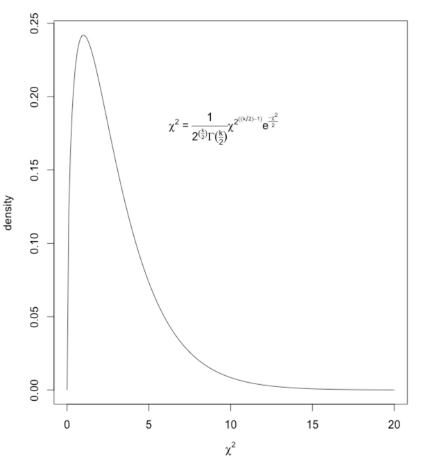
What I have done is to draw a chi-square distribution on 3 df and then write in the equation for the generic chi-square as a legend. (You don't need to have the slightest idea of what chi-square is to understand how to do the plotting.) The code and result are shown below.
x <- (0:200)/10
a <- dchisq(x,3)
     #get the density (height) of chisq at each value of x
z <- expression(chi^2)
myequation <- expression(paste(chi^2, " = ", frac(1,2^(frac(k,2))*Gamma(frac(k,2) ) )*
chi^2^((k/2)-1)*e^frac(-chi^2,2)))
plot(a ~ x, type = "l", ylab = "density", xlab = z)
legend(5, .20, legend = myequation, bty = "n")
     # bty = "n" tells it no box around the legend -- "bty" stands for "box type"
It is one thing to know in advance what you want to write on a figure. (e.g. you want to write that chi-square = 2.45.) But what if you want to write a mathematical expression, such as the Greek chi-square, and then follow it with a variable computed from the data. (You don't know what that value will be, so you can't just type it in your command.) In other words, instead of using legend(7,.2,"chi-square = ",67.73), you want to write "chi-square" in Greek, and then follow it by the actual calculated value. That is a bit trickier. You will need to use "bquote" here. (Typing ?bquote is not likely to leave you any more informed.) The code follows. I am drawing 5000 observations from a chi-square distribution, sorting them, and finding the value that cuts off the top 5%. That value will change slightly with each run because these are random draws.
nreps = 5000
csq <- rchisq(nreps,3)
     # Draw 5000 values from a chi-sq dist on 3 df
csq <- sort(csq)
     # Arrange the obtained values in increasing order
cutoff <- .95*nreps   # The 950th value in ordered series
chisq = round(csq[cutoff], digits = 3)
hist(csq,xlim=c(0,20),ylim=c(0,.3),
main = "Chi-square on 3 degrees of freedom",breaks = 50,
 probability = TRUE, xlab = "Chi-Square")
legend(7,.2,bquote(paste(chi[.05]^2  == .(chisq))))
lines(density(csq), col = "blue")