FOUR - a resource office FOR ALL UVM STUDENTS!
Who/What is FOUR?
The University of Vermont Office of Fellowships, Opportunities, & Undergraduate Research (FOUR) provides a central location for ALL of UVM's undergraduate students to find out more about research and creative activities available to all UVM undergraduates. FOUR also provides guidance and support for all students, past and present, in search of nationally competitive fellowships.
FOUR provides a resource to help students find opportunities and information for pursuing a deeper learning experiences through fellowships, undergraduate research, and beyond. Opportunities for undergraduate research are extensive and limited only by your imagination. Research can be conducted independently, on a team, directed by a faculty member, within the university, or in an outside facility. Nationally competitive fellowships are available to all students and alumni of the University of Vermont and the office provides support as well as endorsements throughout the application processes.
Fellowships
At their core, academic fellowships are prestigious opportunities that support your academic and professional development. A fellowship is essentially a financial grant or stipend to pursue specific areas of study, research, or professional endeavors without the need for employment. Fellowships are designed to cover expenses such as tuition, living costs, research, travel, and any other necessary costs associated with the fellow's pursuits. They are awarded based on merit and are highly competitive, often requiring applicants to demonstrate outstanding academic achievement, leadership potential, and a commitment to their field of study or work. They also require time to investigate options and prepare documents for submission. You must plan well in advance of the deadline.
Fellowships offer recipients a wealth of benefits beyond financial support. They provide invaluable experiences through research projects, internships, study abroad opportunities, and professional development workshops. These experiences enable fellows to gain specialized knowledge in their field, develop a professional network, and enhance their resumes. For many students, preparing a fellowship application can be transformative. For recipients, fellowships open doors to advanced study, prestigious careers, and influential roles in their communities and beyond.
Opportunities
FOUR can help advise students on internships and other funding opportunities both internal and external to UVM. Below are some examples:
- Pre-Medical/Pre-Health Enhancement Program (PEP)
- Office of the Chief Medical Examiner Internships (OCME)
- Student Research Conference (SRC)
- Other Internal and External Opportunities
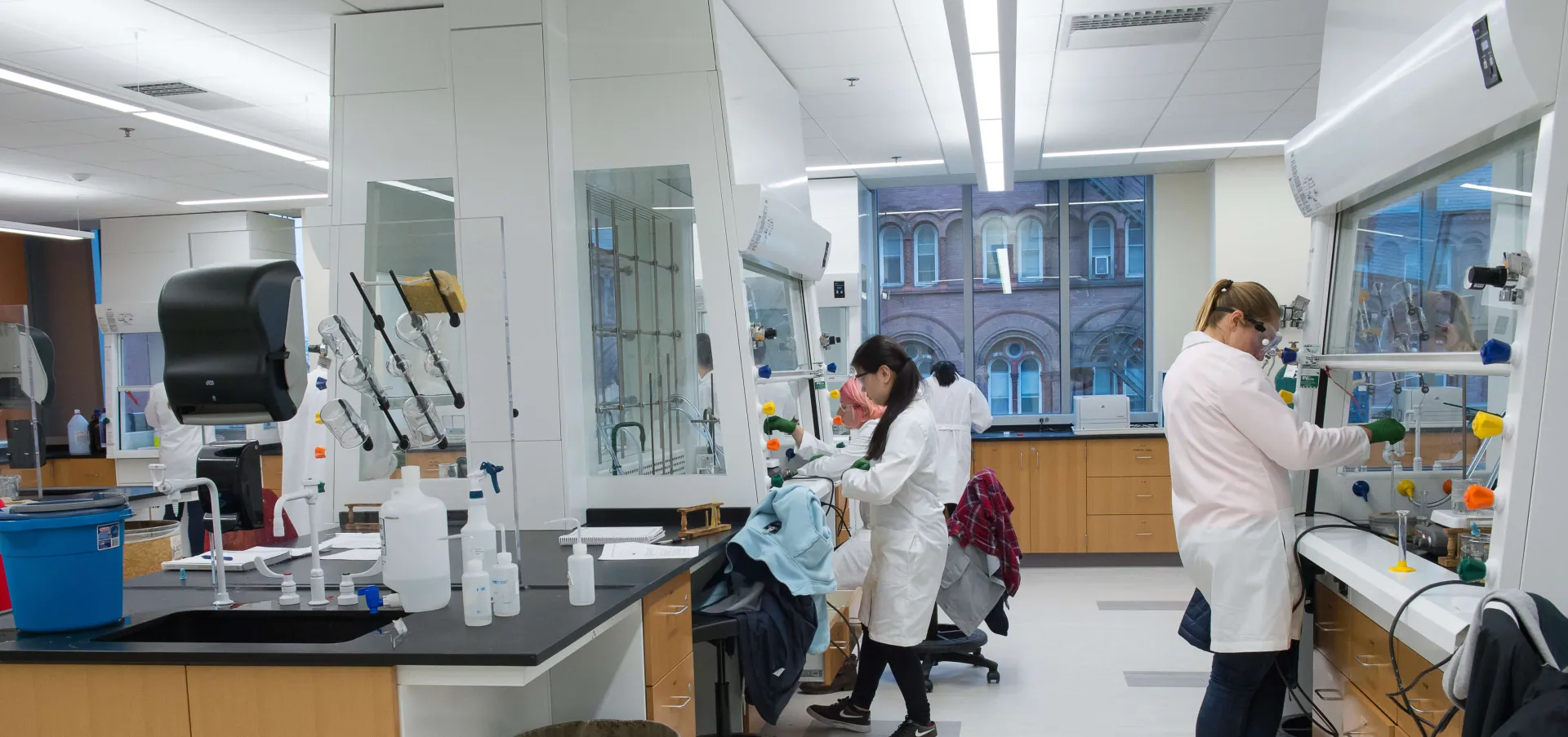
Undergraduate Research
The University of Vermont is one of the top-ranked small, public research institutions in the country. Our gifted faculty contributes enormously to their disciplines and to the lives of our students, and undergraduate research helps provide our students with extremely valuable experiences. You could have the opportunity to work closely with scholars who are experts in your interest area, gaining hands-on experience, receiving direct mentorship and building collegial relationships. Undergraduate research can make you look at terms and techniques learned in the classroom in a whole new way. You can build a very impressive resume and academic record, which will promote you to the graduate school, professional school, or a position of your choice. Above all, you will learn about yourself, what interests you, and sometimes what does not.
Interested?
Explore - Connect - Engage
UVM has energetic students engaging in their communities, impacting their academic fields and the world. FOUR is an office for anyone and everyone that wants to explore opportunities, connect with resources, and engage in a plan for their own future.
Get Started in ResearchExplore - Connect - Engage
UVM has energetic students engaging in their communities, impacting their academic fields and the world. FOUR is an office for anyone and everyone that wants to explore opportunities, connect with resources, and engage in a plan for their own future.
Get Started in Research