 Semiotic Analysis of An Advertisement
Jeff Henry
Wednesday, March 10, 1999; Sociology 43
Semiotic Analysis of An Advertisement
Jeff Henry
Wednesday, March 10, 1999; Sociology 43
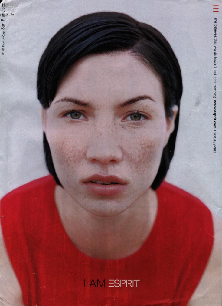
Flipping through the pages of Glamour you are bombarded with advertisements geared for selling things such as make-up, clothes, underwear, and so on. What you see is a cultural pattern, beautiful woman after beautiful woman, representing some product selling that product, but more importantly selling that product's image. Upon coming across this advertisement (which was the first in a series of similar ones for the same company) I noticed something different, something that was being said that was a little askew from the other advertisements in the magazine. Granted the advertisement is still selling an image, but what this company, Esprit, is selling is something that is obviously trying to be different from the rest. At first glance the advertisement's connotations did not fit into the code we have for femininity, a code exploited by other advertisements.
The first thing I noticed looking at this advertisement is how my eyes were drawn to hers. In the picture there is denoted a girl, slick black hair, red shirt, and some words: "I AM ESPRIT" and [in small type along the upper right edge,] `'She believes that words haven't lost their meaning." The girl has freckles, short hair, green eyes, and appears to be leaning forward. We see her head, shoulders and that is it, no body, breasts, or long legs. Part of what is so important to this ad is what is not denoted, and how what is there is used.
The girl has excellent symmetry, not only in her facial features (complimented by her slicked hair), but also in her positioning on the page. This symmetry is complemented by her forward stance, creating a closer proximity with her face (rather than her body) for the viewer. The advertisement uses color contrast between red shirt and black hair to center your eyes on her rather pail face, and more specifically her green eyes. What is crucial to this advertisement is that attention is attracted to the right places. In this case her hair is black for contrast but more importantly it is short and slicked, and doesn't consume the reader's eye. On the bottom side the red shirt serves several purposes: 1. It counters the black hair on the top of the head, 2. It gains enough attention to serve as a great backdrop for the words "I AM ESPRIT", but 3. The red is blurred or dulled to let you know where the focus is. The focus is brought directly to her eyes, but why?
There are, of course, reasons why the creators of this advertisement want us to be caught up in the eyes of this woman, to sell an image, and likewise there are several ways they go about selling this image. The advertisers have created a confrontation with her eyes. You notice she does not possess the "male gaze," rather she seems to twist this gaze into a stare, or as 1 said a confrontation. Her forward posture, is part of what lets us know this is not a "look"' or flirtation with the camera. Her eyes signify a strength or unwillingness to be submissive. The other part relies on that about her which is different from other advertisements, and the paradigmatic relations of the words to the pictures.
What is different about this advertisement is literally plain to see. She has no (or no noticeable) make-up on, has short "boyish" hair, and freckles. She is what advertisers may call normal, not a normal model but closer to the girl next door definition of normal. She is not sexualized; she is shown from shoulders up, no legs, and no breasts. The advertisement forces eye contact with her and your recognition of her simplicity or "plainness in order to transcend its message. The message is built upon a system of relationships that are less familiar to magazine readers and therefor eye catching. She does not fit immediately into our code for femininity. Her abnormality lies in her apparent normality to the onlooker. So what is the advertiser trying to do? In order to understand this question we must look at the paradigmatic relationships between the words and the picture.
First the advertisement declares that this woman is Esprit; "I AM ESPRIT." The words get their meaning from the picture, the image, the stare, and the confrontation. Through the vehicle of this image of a "normal", empowered, individual, who stands out from the fashion norm, Esprit wants to create a schema in which their product represents the stare. The consumer is supposed to pair liberation, power, and the uniqueness of this female with the product. It is an oxymoron that Esprit fashion somehow is anti-fashion or anti all that is associated with fashion.
The other words denoted in this advertisement are "She believes that words haven't lost their meaning." This statement supports the ideology that image dominates modern culture (an ideology supported by other ads), and supports the suggestion that this woman is different, independent or not confined to the norm. "She believes..." further supports the superficiality of other advertisements by downplaying Esprit's recognition of the importance of image. Esprit is trying to counter the previously set cultural code of the femininity supported by the fashion industry.
This advertisement simply wouldn't work the same if she were half-naked with her fingers in her mouth engaged in a male gaze. That is not the image, or shall I say counter-image, they want. Ironically the words in this advertisement do indeed get their meaning from the images of the picture. It is true the words haven't lost their meaning; but it's just a matter of how they want us to put the meaning to those words.