I discuss kernel density plots in Chapter two of Statistical Methods for Psychology, 8th ed, but I do not show there how to use software to generate them. (The second program in list of R programs does calculate and plot a kernel density function using R.) Below are two programs, one for SPSS and one for R that will do what you want.
SPSS does a very nice job of computing kernel density plots, but you can not simply call them up using the drop down menus. Instead you have to use SPSS syntax to issue the instructions, but that is not particularly difficult. For those not familiar with SPSS syntax, it is just a bunch of lines of code that tell SPSS what to do. When you do anything from a drop down menu, SPSS creates its own syntax file, though you don't usually see it. If you get all set to run an analysis and click "Paste" instead of "OK," the program will create a file containing the syntax you have created through the menus. You can then save this to be used later, or you can run it immediately by clicking on the Run button. What is different here is that you won't even try using drop down menus. Assuming that you have already loaded the data file, you will simply copy the syntax below, tell SPSS to create a new syntax file, and paste that syntax in. Then click Run. To run the syntax with other data you will need to change the variable names in the syntax statements, but doing so should be obvious.
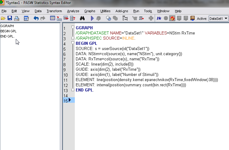
GGRAPH
/GRAPHDATASET NAME="DataSet1" VARIABLES=NStim RxTime
/GRAPHSPEC SOURCE=INLINE.
BEGIN GPL
SOURCE: s = userSource(id("DataSet1"))
DATA: NStim=col(source(s), name("NStim"), unit.category())
DATA: RxTime=col(source(s), name("RxTime"))
SCALE: linear(dim(2), include(0))
GUIDE: axis(dim(2), label("RxTime"))
GUIDE: axis(dim(1), label("Number of Stimuli"))
ELEMENT: line(position(density.kernel.epanechnikov(RxTime,fixedWindow(.08))))
ELEMENT: interval(position(summary.count(bin.rect(RxTime))))
END GPL.
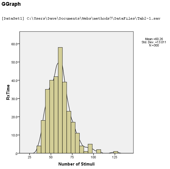
The resulting screen will look like the following. Notice the "Run" button -- ![]() -- in the top line.
-- in the top line.
You will see that the syntax contains variable names. As I just mentioned, you will have to change those to match the names of your variables. You will also want to variable labels. I think that this is all you will need to change. The results follow.
The web has a number of sources that may be helpful, and a quick Google search will be profitable. Two sources that I recommend are
http://www.ats.ucla.edu/stat/spss/examples/ara/foxch4.html
and
http://school.maths.uwa.edu.au/~duongt/seminars/intro2kde/
I suspect that my syntax may have come from a modification of the first site. The second contains a bit of theory about plots and some of the alternative choices you have. Also, typing "Kernel Density" into the SPSS help window search box will give you a list of possible options you might choose.
I just rebuilt my laptop and have not yet reinstalled SAS on it. However there is a kernel density procedure in SAS named PROC KDE, and a small bit of searching on the web or the SAS help files will show you how to use it. I may add that later. You can also produce kernel density plots under the histogram procedure of Proc Univariate. A simple example is shown below.
Options LineSize = 78;
data Expenditures;
infile 'C:\Users\Dave\Documents\Webs\methods8\DataFiles\Tab15-1.dat' firstobs = 2;
input id State $ Expend PTratio Salary PctSAT Verbal Math SATcombined PctACT ACTcombined LogPctSAT;

proc univariate;
   histogram SATcombined LogPctSAT Expend/
   kernel (k = normal
           c = 0.8
		   w = 2.5
		   color = green);
   run;
dch: