plot(data)

One of the things that R does best is graphics, but whole books have been written around R graphics and I can't come close to covering the whole field. I will instead cover the basic graphs and present some detail on using low-level functions to improve the appearance and the clarity of a graph.
I will use the Add.dat data found on the book's Web site. This file contains data on an attention deficit disorder score, gender, whether the child repeated a grade, IQ, level and grades in English, GPA, and whether the person exhibited social problems or dropped out of school. So we first need to read in those data.
data <- read.table("https://www.uvm.edu/~dhowell/methods/DataFiles/Add.dat", header = T)
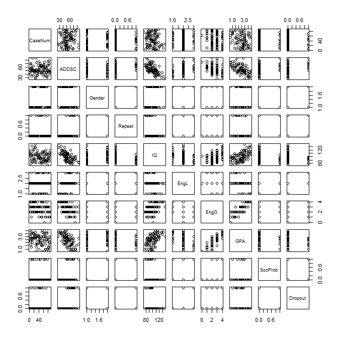
This simplest command for plotting the variables is the "plot()" command.
plot(data)
No, it doesn't do much for me either, but it does give us a bit of a handle on how variables are related. This command plots every variable against every other variable. The only interesting looking graph in the previous figure is the one plotting GPA against IQ. We will use that to illustrate the kinds of things that we can do using what are called lower-level graphics, which include things like labeling the axes, changing color, etc. The following R program is pretty much overkill because I want to illustrate a whole bunch of things.
Histograms appear throughout the book and are one of the best ways to understand what a set of data look like. Moreover, many of the lower level commands that go with histograms also apply to other graphics that we can create. So we will start with a histogram of GPA. The first graph will be very simple, but then we will add some useful features such as a title. The code for a plain old histogram is:
attach(data)
hist(GPA)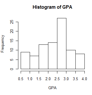
Oh Dear! We just came across something that I haven't talked about yet. When you read in a whole data file with several variables, it is something called a data.frame. So "data" starts out as a data.frame. If you wanted to address a specific variable, e.g. IQ, you would need to refer to it as "data$IQ" or "data$GPA." That gets to be awkward. But if you type "attach(data)," you can now refer to a variable as IQ or GPA, without the "data$" coming first. That's easier, and that is why you will often see me enter "attach(data). If you try something like plot(GPA) and get an error message that it can't find GPA, or that GPA doesn't exist, while you know damn well it does exist, it is most likely because you forget to attach the data.frame. But I digress.
The plot above isn't a bad histogram, but there are things that we can do to make it better. I admit that some of this is overkill, but I am trying to illustrate a variety of commands, so you'll have to put up with it. Suppose that I would prefer that the title was just plain "Grade Point Average" instead of the default title you see. Also suppose that I would like to label the X axis as "GPA in 9th grade." Also, I want to show the mean and the variance in a text box, and perhaps put a box around them. Finally, I want to have more bins (20) and I would like some crosshatching, also in blue to make things pretty. The following code will do that for us.
hist(GPA, main = "Grade Point Average", xlab = "GPA in 9th grade",
  density = 10, border = "blue" , breaks = 20, col = "blue")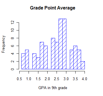
Notice that all of those changes were made within the "hist()" command. There are a number of other things that we could do within that command, such as specify the minumum and maximum values for the X or Y axis using xlim = c(0,4), but you can find those by typing ?hist on the console. (You might want to specify the axes that way if you had two or more histograms and you wanted them to be comparable."
But beyond filling up the hist() command, you can add additional features by using lower level graphics commands. (Here I am getting very carried away, and you probably don't want to learn all this stuff now. But there will come a time when you do want it, and you can just come back to this page, copy what I have here, and modify it for your needs.) For instance to add a text box we have a separate command that specifies what we want. We can also impose a kernel density line using the "lines(density = )" command. Again, you can see what other features these commands support by typing ?text or ?lines. Because I want to add a kernel density plot, I have to redraw the original histogram after specifying that I want probabilities rather than frequencies on the Y axis. The new code and plot follows.
hist(GPA, main = "Grade Point Average", xlab = "GPA in 9th grade",
  density = 10, col = "blue", breaks = 12, probability = TRUE)
# I know that the mean and variance are 2.45 and 0.74
meanvalue <- expression(paste(bar(x) == 2.45))  # set this up to write out
variance <- expression(s^2 == 0.74)             # nice text using symbols
legend(1,0.7, c(meanvalue, variance))           # The first two entries are X and Y coordinates for upper left of box.
lines(density(GPA), col = "red")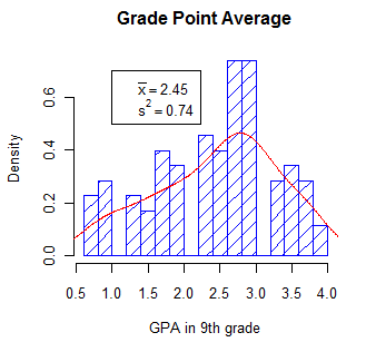
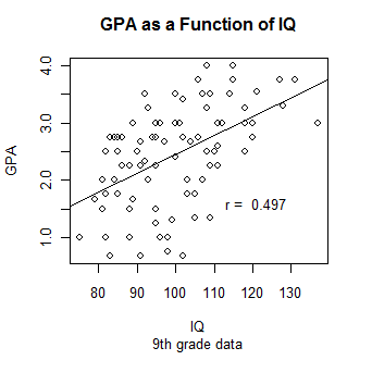
Histograms display the distribution of one variable, while scatterplots display two variables, one as a function of the other. What would make sense is to display GPA as a function of IQ and to provide the necessary labels and other characteristics. I am also going to want to insert a regression line, which I will calculate using the lm() function in R. And finally I want to print the correlation coefficient directly on the graph. But, until I see the graph, I don't know where there will be enough blank space to fit it in. So I will use the locator() command to have R pause, wait until I click on a nice clear space, and then print r. Consider the following code:
plot(GPA ~ IQ, main = "GPA as a Function of IQ", sub = "9th grade data")
regress <- lm(GPA ~ IQ)
abline(regress)
r <- round(cor(GPA, IQ), digits = 3)
text(locator(1), paste("r = ",r))  #Cursor will change to cross. Click where you want r printed
I am going to jump ahead to include what is called an interaction plot. I am doing so because this is a function that I think that you should know about, even if you don't have a use for it until later. The basic idea is that we have a variable (call it score) whose mean changes over conditions. Moreover, the change across conditions varies for different groups. To take a specific example from Chapter 13, Spilich and his students looked at how task performance varied as a function of smoking (non-smokers, delayed smokers, and active smokers). They looked to see if changes due to smoking varied across different tasks. These data are found in Sec13-5.dat.
data <- read.table(file.choose(), header = TRUE)
head(data)  #Ignore variable labeled "covar"
  Task Smkgrp score covar
1    1      1     9   107
2    1      1     8   133
3    1      1    12   123
4    1      1    10    94
5    1      1     7    83
6    1      1    10    86

attach(data)
Task <- factor(Task, levels = c(1, 2, 3), labels = c("PattReg", "Cognitive", "Driving"))
Smkgrp <- factor(Smkgrp, levels = c(1,2,3), labels = c("Nonsmoking", "Delayed", "Active"))
interaction.plot(x.factor = Smkgrp, trace.factor = Task, response = score, fun = mean)
I have spent a lot of time figuring out the easiest way to add mathematical symbols to text and to include either a predefined value of some variable or the value that the program has just calculated. So you are going to have to either put up with a section on how to do that or else skip it. At least it is here if you need it.
To add math symbols you need to use a function like "expression", "substitute", "bquote", and others. I hate to say it, but these are not described well in any source that I have seen, especially in the help menus. (I get them to work mainly by trial-and-error or by copying what someone else did.) So if you need to do something like I do below, just take my code and substitute your own commands and variables in place of mine. And then see if it works. And then fix it again and see if it works, ... (I have been down this path many times.) This following does work, but I would hate to have people know how long it took me to get that equation to come out the way I wanted it.
What I have done is to draw a chi-square distribution on 3 df and then write in the equation for the generic chi-square as a legend. The code and result are shown below.
x <- (0:200)/10
a <- dchisq(x,3)          #get the density of chisq at each value of x
myequation <- expression(paste(chi^2, " = ",frac(1,2^(frac(k,2))* Gamma(frac(k,2) ) )* chi^2^((k/2)-1)*e^frac(-chi^2,2)))
plot(a ~ x, type = "l", ylab = "density", xlab = "Chi-Square")
legend(5, .20, legend = myequation, bty = "n")    #bty = "n" tells it no box around the legend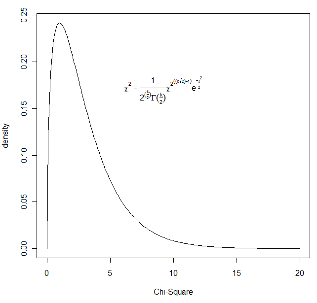
It is one thing to know in advance what you want to write on a figure. (e.g. you want to write that chi-square = 2.45.) But what if you want to write a mathematical expression, such as the Greek chi-square, and then follow it with a variable computed from the data. (You don't know what that value will be, so you can't just type it in your command.) In other words, instead of using legend(7,.2,"chi-square = ",chisqvalue), you want to write "chi-square" in Greek, and then follow it by the calculated value. That is a bit trickier. You will need to use "bquote" here. (Typing ?bquote is not likely to leave you any more informed.) The code follows. I am drawing 5000 observations from a chi-square distribution, sorting them, and finding the value that cuts off the top 5%. That value will change slightly with each run because these are random draws.
nreps = 5000
csq <- rchisq(nreps,3)                   # Draw 5000 values from a chi-sq dist on 3 df
csq <- sort(csq)                         # Arrange the obtained values in increasing order
cutoff <- .95*nreps
chisq = round(csq[cutoff], digits = 3)   # The 950th value in ordered series
hist(csq,xlim=c(0,20),ylim=c(0,.3), main = "Chi-square on 3 degrees of freedom",breaks = 50,
+ probability = TRUE, xlab = "Chi-Square") #The + sign supplied by R to indicate continuation of previous line.
legend(7,.2,bquote(paste(chi[.05]^2  == .(chisq))))
lines(density(csq), col = "blue")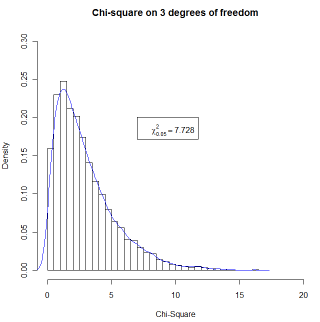
The combined code for all of these graphics is given below. You can easily cut and paste this into any editor and run it in R. I have added the command "par(ask = TRUE)" at the top. This means that after printing the first graphic it will pause when you ask for the next graphic and wait for you to tell it to print that graph. You will see the word "next" in little (very little) type in the upper left corner of the graph. Just click on that. (You can comment the "par(ask = TRUE)" line out if you want to submit commands one by one rather than as a batch. You may have to use the console to enter "par(new = FALSE)" if you have run the code before and have "TRUE" stuck in the on position. The other trick is that the fifth graphic has a "locator function." This means that nothing more will happen until you put the cursor somewhere on the graph where you want the text and click once.
# Graphics page for Methods 8
par(ask = TRUE)
data <- read.table("https://www.uvm.edu/~dhowell/methods/DataFiles/Add.dat", header = T)
plot(data)
#--------------------------------------------------------------------------------------------
attach(data)
hist(GPA)
#--------------------------------------------------------------------------------------------
hist(GPA, main = "Grade Point Average", xlab = "GPA in 9th grade",
  density = 10, col = "blue", breaks = 12)
#--------------------------------------------------------------------------------------------
hist(GPA, main = "Grade Point Average", xlab = "GPA in 9th grade",
  density = 10, col = "blue", breaks = 12, probability = TRUE)
# I know that the mean and variance are 2.45 and 0.74
meanvalue <- expression(paste(bar(x) == 2.45))  # set this up to write out
variance <- expression(s^2 == 0.74)             # nice text using symbols
legend(1,0.7, c(meanvalue, variance))           # The first two entries are X and Y coordinates
lines(density(GPA), col = "red")
#--------------------------------------------------------------------------------------------
plot(GPA ~ IQ, main = "GPA as a Function of IQ", sub = "9th grade data")
regress <- lm(GPA ~ IQ)
abline(regress)
r <- round(cor(GPA, IQ), digits = 3)
text(locator(1), paste("r = ",r))  #Cursor will change to cross. Click where you want r printed
#--------------------------------------------------------------------------------------------
#Adding mathematical symbols and values

x <- (0:200)/10
a <- dchisq(x,3)          #get the density of chisq at each value of x
equation <- expression(paste(chi^2, " = ",frac(1,2^(frac(k,2))* Gamma(frac(k,2) ) )* chi^2^((k/2)-1)*e^frac(-chi^2,2)))
plot(a ~ x, type = "l", ylab = "density", xlab = "Chi-Square")
legend(5, .20, legend =equation, bty = "n")    #bty = "n" tells it not to plot a box around the legend

# But this won't allow us to have the value of a variable printed. So
# We use bquote to do this. (I don't understand bquote, but it works.
# Calculate the value that cuts off the top 5% of this particular distribution of 1000 values

nreps = 5000
csq <- rchisq(nreps,3)                   # Draw 5000 values from a chi-sq dist on 3 df
csq <- sort(csq)
cutoff <- .95*nreps
chisq = round(csq[cutoff], digits = 3)     # The 950th value in ordered series
hist(csq,xlim=c(0,20),ylim=c(0,.3), main = "Chi-square on 3 degrees of freedom",breaks = 50, probability = TRUE, xlab = "Chi-Square")
legend(7,.2,bquote(paste(chi[.05]^2  == .(chisq))), bty = "n")
lines(density(csq), col = "blue")