
The first of these code sections deals with the example behind Figure 15.1. I began by assuming that the mean and standard deviation of the two populations were equal to those that Aronson et al. found. I assumed that the sample sizes would both be 20, which means that the critical value of t on 38 df is +2.024. I drew 10,000 samples from normal populations and counted the number of times that tobt was greater than 2.024 or less than -2.024. If you look at the code, the second line from the bottom shows you something that you have not seen before. That vertical line (|) translates to "or." Instead of counting the number of results >= 2.024 and then counting the number of results <= -2.024, I did it in one line by inserting both of those conditions separated by |, which stands for "or".
I want to repeat what I have said before about the polygon. Perhaps I am the only one who screws them up, but I certain do. So I am going to be very pedantic. Suppose that you wanted a polygon that encompassed the area under the curve from z = 1 to z = 2. The first point is at (1,0). Then go up to (1, dnorm(1.0, 0, 1) = (1, 0.242). Then go right to, perhaps, x = 1.01 and find y (y <- dnorm(1.01, 0,1) = 0.240) Then right to ( 1.02, 0.237) ..... right to x = 2.0, y = 0.054. But don't stop there. You have to drop down to (2.0, 0.00). The polygon function will then take over and go back to the starting point, filling in the enclosed area. (If you were plotting the t distribution, for example, you would change "dnorm(1,0, 0, 1) to dt(1.0, df = 38), and so on.) If you did not end by going down to the x-axis, the polygon will draw itself from max(x), height(y) straight back to the beginning, and your shaded area will be above the line, which is certainly not what you want.)
### Figure 15.1
### Replication of example in text
mu.c <- 9.64; sigma.c <- 3.17
mu.t <- 6.58; sigma.t <- 3.03
nreps = 10000
t.computed <- numeric(nreps)
for (i in 1:nreps) {
   sample.c <- rnorm(20, mu.c, sigma.c)
   sample.t <- rnorm(20, mu.t, sigma.t)
   t.computed[i] <- t.test(sample.c, sample.t)$statistic
}
prob <- (length(t.computed[t.computed >= 2.024 | t.computed <= -2.024]))/nreps
cat("The probability of t exceeding +- 2.024 = ", prob)

##################################################################
### Most of the code here deals with generating overlapping distributions
### as in Figure 15.2.

# Generate a sequence of x values
x <- seq(-6, 6, by = 0.001)
par(mfrow = c(3,1))
# Plot normal curve over x  with mean at 1.0
plot(x, dnorm(x, mean = 0, sd = 1), type = "l")

par(new = T)
plot(x, dnorm(x, mean = 1, sd = 1), type = "l")
# Define left side boundary using min(x)
# and CritVal using alpha = 0.05

alpha <- 0.05
LCrit <- qnorm(alpha / 2)       #LCir = -1.96
UCrit <- qnorm(1-alpha/2)

xl <- seq(min(x), LCrit, length = 100)
yl <- c(dnorm(xl,0,1))

PUpper <- 1-pnorm(UCrit, 1,1) ; PUpper
PLower <- pnorm(LCrit,1,1); PLower
PTwotailed <- PUpper+PLower;  PTwotailed

# add CritVal and yl = 0 to complete polygon
xl <- c(xl, LCrit)
yl <- c(yl,0)

# draw and fill left region
polygon(xl, yl, density = 50)
arrows(-4,.1,-1.96,.01)
arrows(4,.1,1.96,.07)
text(-4.0, .15, "p(z < -1.96) = .002")
text(4.0,.15,"p(z > + 1.96) = .169")
text(-1.5,.35,"Null" )
text(2.5,.35,"Alternative")
# Do the same for right side boundary using max(x)
# and Crit Val


xu <- seq(UCrit, max(x), length = 100)
yu <- c(dnorm(xu,1,1), 0,0)

# add max(x) and CritVal to complete polygon
xu <- c(xu, max(x) , UCrit)

# draw and fill left region
polygon(xu, yu, density = 50)
The next little bit of code uses the pwr package, and the pwr.t.test() function within it to calculate the power of that design. Notice that we put in both the effect size (d) and the sample size (n). The same function handles other t tests, so you need to specify that you are using a one-sample test.
### The calculation of power for section 15.4
library(pwr)
pwr.t.test(n = 29, d = 0.41, sig.level = .05, type = "one.sample")
One-sample t test power calculation
_____________________________________________________
              n = 29
              d = 0.41
      sig.level = 0.05
          power = 0.5682491
    alternative = two.sided
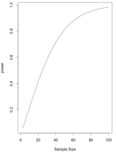
Another way to look at power is to simply vary the sample size so that we have it print out power for each n. Then we can read off the n that gives us the power we want. This is not an efficient way to do things, but it illustrates what happens as n increases. You can see that power exceeds .80 only when n gets to 49. You could plot power as a function of n, but I will leave that to you. To do that you should store n and power as you go along. If the code looks odd to you and you wonder why you have that "$power" in there, just type "names(power)."
### Calculating power as n varies.
### Let n run from 25 to 50
library(pwr)
power.value <- numeric()
for (n in 1:100) {
   power <- pwr.t.test(n = n, d = 0.41, sig.level = .05, type = "one.sample")
   cat("n = ",n, "   power = ", power$power, "\n")
   power.value[n] <- power$power
}
x <- seq(1:100)
plot(power.value ~ x, type = "l",xlab = "Sample Size", ylab = "power")