
Psychologists are strange people. We teach them how to do all sorts of wondrous things, and they don't pay any attention. They behave just like real people. But perhaps there's hope. Colin and Jennifer met in graduate school, and decided that marriage was much too complicated. So they just lived together. But that had its own complications, and about the time that they were in their late 30's and had secure faculty appointments at a good university, they finally decided to get married. They even decided that having children would be nice, as long as they could find someone to look after the children, cook their meals, wash their clothes, take them for walks in the park and later to soccer practice, and do it all for $6 per hour with no benefits.
But then came thoughts of all the problems that children bring. The kids might not be very smart. They might get into fights with the kids next door, and spark a lawsuit. They might want to go to college at a school where Colin and Jennifer don't get a tuition waiver. So our protagonists decided that they ought to do a little research on this kid thing before they got themselves into what a former U. S. president called "deep doodoo." Being trained as psychologists, they knew that there must be data available that speak to their problem, and they went hunting for it.
A quick search of the web produced some data on newborn infants. Gary McClelland, at the University of Colorado, once had a collection of Apgar scores for 60 children, along with characteristics of the child's mother. (The data are available as both a text file at apgar.dat and as an SPSS system file at apgar.sav. A text file is one that you would produce with a standard text editor (such as Notepad) and that you can read, while a system file is produced by SPSS, has information about file names, variable and value labels, and so on. You and I can't read such a file, but SPSS will open it easily.) An Apgar score is a measure of neonatal development. You simply rate a newborn infant as 0, 1, or 2 on each of 5 dimensions (heart rate, breathing effort, muscle tone, reflex initiability, and color), and then sum those scores, giving an Apgar score of 0 - 10, where 10 is best.
The Apgar data file also contains information on the sex of the child, whether or not the mother smokes, how much weight the mother gained during her pregnancy, the gestational age of the child, the degree of prenatal care the mother received, and the family's annual income. Thus these data provide the opportunity to examine the relationship between several important variables and the health of the newborn child. They may give Colin and Jennifer useful information for making decisions.
This supplement is intended to do two things. The first is to illustrate the use of SPSS, and the second is to base that presentation around an additional example. I have chosen the example of our friends Jennifer and Colin because, although they are fictitious, the data speak to some real issues that confront people. What do psychologists know about neonatal development that can guide our behavior? I have chosen to use SPSS because it is one of the most popular statistical packages available, and because it will do all of the analyses we need. In fact, its ability to do so many different kinds of analyses will help us to discover things in the data that we might not discover if we were working with simple pencil and paper.
SPSS is a very powerful statistical analysis package. Just about everything we would want to do with these data can be done by the use of simple pull-down menus. Once you become familiar with the menu structure, you can pretty much figure out how to do whatever you need, including data transformations, graphing, and statistical analyses. This document was originally written for an earlier version of SPSS, and, though I have tried to bring it up to date, there may be an occasional place that I missed. But even if I have left dated material in the document, you should be able to figure out what do do next simply from looking at your screen.
This manual does not go as far as the longer manual, but I think that it is a better place to start. If you work through this manual, statistical tests and procedures that are more advanced than those presented here should not present a major problem. First of all, the hardest part about any software is learning how to set up an analysis, and if you can set up things like t tests, you can probably figure out how to set up other procedures. If you need additional help, you can always go to the longer manual.
The data sets that I have chosen are data that are readily available on the Internet. My goals in searching for data included finding data that would be of interest to readers, that contained a reasonable number of cases, and that fit together to allow me to "tell a story." A common approach is to select several different data sets to address different kinds of problems. I chose, instead, to select data that focused on the same general problem, and the problem that I chose was prenatal development. Psychologists, pediatricians, and epidemiologists actually know quite a bit about the influence of various maternal behaviors on subsequent development of the embryo. I will use two data sets in this supplement.
This chapter is intended as an introduction to SPSS. We will see how to read or enter data, how to provide labels for our variables, how to specify the nature of our variables and how they will be presented, and how to save them in a useable format. The specifics of using SPSS to graph data and to run statistical analyses will be covered in subsequent chapters when needed.
There are so many features of SPSS that I cannot even attempt to cover them all. What I will present here will get you off to a solid start, and the rest you can learn on your own. The nice thing about computer software, especially when it is menu driven, is that you can experiment. As long as you save your data, you really can't do any harm. If you want to find out how something works, click on it and see what happens. The worst that can happen is that you will have to reload your data and start again, and that is hardly the end of the world. You should also remember that there is a help menu available. When all else fails, you can give up and look things up in the manual. But most people don't read manuals. (In fact, most manuals don't seem to be written to be read.) So play around first, and then go to the manual. You'll learn more that way. And if you still don't want to go to the help pages, do what I do and go to Google and type something like "How do I calculate a mean using SPSS?"
I will begin with the assumption that you have a copy of SPSS loaded on the computer that you are using. If you have trouble installing the software, your instructor will be able to assist you. What follows was written specifically for people running the student version, but will apply equally well to the complete version or to the graduate package.
To open SPSS you double click on the icon on your screen if there is one. If not you will find it listed on the Start menu (probably under Programs) and can open it from there. Depending on how your copy is configured, it may come up with a standard spreadsheet, or it will ask you what you want to do. If the later, indicate that you want to create a new data file.
If you are one of those people like me who can spend a lot of time getting just the right configuration, you'll be in heaven with the preferences windows. You can set anything you can imagine, and some that you may regret having set. If you like playing when you should be working, these preferences are for you. On the other hand, if you just want to start up a piece of software and get to work, you can ignore the preferences entirely. It may mean that your printout (and even your dialog boxes) will look slightly different from mine, but that should not lead to even little problems.
There are several ways to enter data into SPSS, and we'll cover the three most common ones. You can start with a blank spreadsheet and type in the data. We'll do that first. Alternatively, if you have the raw data in a text file, also known as an ASCII file or a dat file, you can tell SPSS to read those raw data into the spreadsheet. Finally, if you or someone else has entered the data into SPSS and saved it as a system file (usually with the .sav extension), you can simply open that file. It is also possible to read data from an Excel spreadsheet or other kinds of file formats, but we will skip that route. You should be able to figure it out on your own. (Hint: just click on the file/open menu and select the appropriate type of format.)
We will start by entering data by hand from the keyboard. This is the easiest approach when you have the raw data on paper, and need to type (some would say "keyboard," but not me) it into a file. This is particularly convenient when you have a small set of data.
The following is a small portion of the Apgar data that Jennifer and Colin are interested in. I have included only six variables and five cases to save space, but all of our analyses will be done on the complete data set.
OBS |
APGAR |
GENDER |
SMOKES |
WGTGAIN |
GESTAT |
1 |
6 |
1 |
0 |
22 |
37 |
2 |
5 |
1 |
0 |
50 |
35 |
3 |
4 |
1 |
0 |
60 |
36 |
4 |
4 |
2 |
0 |
60 |
37 |
5 |
6 |
1 |
0 |
35 |
41 |
When you start up SPSS you will see a spreadsheet resembling the following figure.
The variable names appear in the grayed-out row and are currently labeled var, var, var, etc. We want to start by entering the names (and characteristics) of our variables. In older versions you could just click on the column names and enter your own. But now you need to go to the bottom of the screen where it says "variable view," click on that and you will see the following screen.
In row 1, type the name of the variable. I would enter "obs," indicating that this column just numbers the observations, but you can type any name you wish. (In older versions of SPSS a variable name cannot exceed 8 characters, and all will come out as lowercase, no matter what you type.) Then enter Numeric as Type, ask for 0 decimals because the observation number is an integer, type "Observation" as the label, and skip the rest of the options. (You could enter Scale as the "Measure" if you want to.
Now move down a row and enter "apgar," and hit enter. The other columns should be filled with SPSS's best guess. Change those if you wish. There are some other things about our data that we might want to specify. If you move to the Width column you can indicate how many digits will be displayed, and in the Decimal column you can specify the number of decimal points to be displayed. Since Apgar scores are integers between 0 and 10, the data will be easier to read if you set the number of decimals to 0.
For some variables you will want to indicate what the values of the variable represent. For example, for Gender, I have labeled this variable "Sex of child." Because I know that the data are coded with a 1 for a male and a 2 for a female, I will click on the three little dots in the Values column and entered 1 next to "Value" and Male next to "Value Label." When I click "Add," that designation will be entered in the box below, where I have already added "2 = Female." (If I forgot to click the Add button now, but hit "Continue" instead, I would get an error message telling me that 2 = Female will not be entered. Click Cancel, then Add, then OK.)
Suppose that there were missing values for Gender. If we just left the column blank, SPSS would enter a period in the cell, and treat that as a missing value. But suppose that we wanted to distinguish between different kinds of missing values. Sometimes data are missing because they weren't collected, sometimes because they "do not apply," sometimes because the person refused to answer, and sometime because the reported value is so absurd that it could not possibly be right. SPSS allows us to specify values for different kinds of missing values. For example, we could use 9 for "Not Reported," 99 for " Does Not Apply," and so on. To tell SPSS to treat these values (here, 9 and 99) as missing, click on the "Missing values" button and enter the various values that you have chosen to indicate types of missingness.
Once you have entered all variable names and descriptions, you can start entering data. Click on the Data View button in the lower left, which will take you back to your spreadsheet. You simply put your cursor in the first cell, enter the value, and move on to the other cells. It doesn't matter whether you work down the page, or across, just so long as you put the numbers in the correct columns. Use whichever approach you find easier.
When you have entered all of the data (or even enough that you are worried about losing them), click on the File/Save menu, supply a file name, and press enter. This will save the data to a "system file," which includes not only the data, but the variable names and labels, information about missing values, and so on. Traditionally SPSS uses the file extension ".sav" for these files.
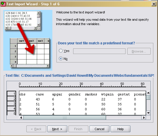
In the case of the Apgar data, we already have all of the variables entered in a text file, also known as an ASCII file. (To do this, you need a copy of the file. So go to the third paragraph in this document, right click on "apgar.dat," select "Save Link as," tell it where to save the file, and you're done. There are two ways of importing ASCII data, depending on how the data are entered in the file. I'll only speak about the File/Open command because I prefer that route.
Select Open/Data from the file menu. You will only see files that end in ".sav," which is not what we want. So go to "Files of type:" and select "Text(*.txt, *.dat). Then you can select the apgar.dat file. You will now see the following dialog box.
You will see that the names of the variables appear as the first row of data, which is not quite what we want. So click "Next", go on to the next window, and click Yes to say that the variable names are included at the top of the file. If things work out nicely, all you have to do is keep clicking "Next." If, however, your variables all seem to be squooshed together, select and deselected various "delimiters" until things look right. Then when you eventually click Finish, you will have your data. You will still want to specify variable labels and such like, but you know how to do that. All of the data files associated with the text include variable names in the first row, so you will always need to let SPSS know that.
Reading ASCII data is easier than entering it by hand, but the easiest way to enter data is to have someone else do the work. If someone else has entered the data, labeled all the variables, and saved the file with a name like apgar.sav, all you have to do is to click on the File/Open menu, navigate to that file, and press "enter." The data will be read in, the proper names and labels will be applied, and you will be all set to go. Since I did the work for you, you can just load the apgar.sav file. To do this, you need a copy of the file. So go to the third paragraph in this document, right click on "apgar.sav," select "Save Link as," tell it where to save the file, and you're done. You can then either go to File/Open and select the file, or you can simply double click on the file icon. As a quick check, there should be 60 lines of data and the first column should read 1, 2, 3, ..., 60. If you see that, chances are that everything is fine.
Every time you enter data, or change the existing data, you should save the file. I know you won't always do that, but if you don't, you are sure to regret it. It is simple to save data and prevent all that anguish. Just press ctrl-S or use the File/Save menu choice. If the data have not already been saved, you will be asked for a file name. Name it whatever you would like, but use ".sav" as the extension. There is no such thing as saving a file too often. The only error is saving too infrequently.
We have spent so much time worrying about how to enter data that we seem to have forgotten Colin and Jennifer, who want to know whether having a baby is a smart idea for them. But now that we have the data in an SPSS file, we are ready to go. But the big problem is "Go where?"
The best way to start with a data file is to examine the individual variables. Before we worry about whether babies and our friends would be a bad match, we should understand what the variables are, how they are distributed, and what values we have for the basic descriptive statistics. It would be a poor idea to jump ahead until we know that much.
Load the data in apgar.sav, as described in the last section, and make sure that you have data for all 60 cases. You may see an additional variable tacked on the end. If so, ignore it for now. You can also delete the variable named "case" if you like. Just click once on the variable name, which will select that column, and hit the delete key.
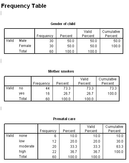
We will start with the Statistics/Summarize/Frequencies procedure, which will show us the values of each variable arranged in order. This would probably not tell us a lot about the variables that have many values, but it will be very helpful for variables, like prenatal care, with few values. I will restrict my analysis to just Gender, Smokes, and Prenatal, but you can look at the rest if you wish.
From the menu, select Statistics/Summarize/Frequencies, and when the dialog box comes up, double click on the three variables of interest. Their names should appear in the box to the right. Then click on Continue. If we were looking at the more continuous variables, we might wish to click on the statistics button and select some descriptive statistics, but for what we are doing here that doesn't make much sense. (The mean Gender is not a very useful statistic.) The resulting printout is given below.
From these results you can see that there were exactly as many boys as girls born into this sample, with 30 of each. That is reassuring, as I would be concerned about the randomness of our sample if there were a 70:30 split. You can also see that 16 out of 60 mothers smoke, giving us 26.7% smokers. This is in line with the data we commonly find about smoking behaviors, though perhaps a bit high.
One interesting finding is that there were 6 mothers who had no prenatal care, and another 12 with little prenatal care. Thus 30% of our sample had little or no care, which should be some cause for concern. We will later look at how prenatal care relates to outcome variables.
Note that each of these tables has a column labeled "Valid Percent." This simply means the percentage of non-missing cases. Since we didn't have any missing data, Valid Percent and Percent are the same thing. Note also the Cumulative Percent column. This is the percentage of cases falling at, or below, this value. Thus 30% of our cases have low or no prenatal care, and 63.5% have moderate, low, or no care.
The variables that we have looked at are nominal or ordinal variables. Now we will go to the other variables, which are roughly continuous and approximately interval. I would like to know at least two things about these variables. I want to know what their approximate distribution is, and I want to know basic descriptive statistics, such as the mean and standard deviation.
Normally I would look at the distribution of a variable before I would look for descriptive statistics, but I will work in reverse here simply to make the process more orderly as far as SPSS procedures are concerned. So the first thing that I want to do is to compute descriptive statistics on the remaining variables of interest.
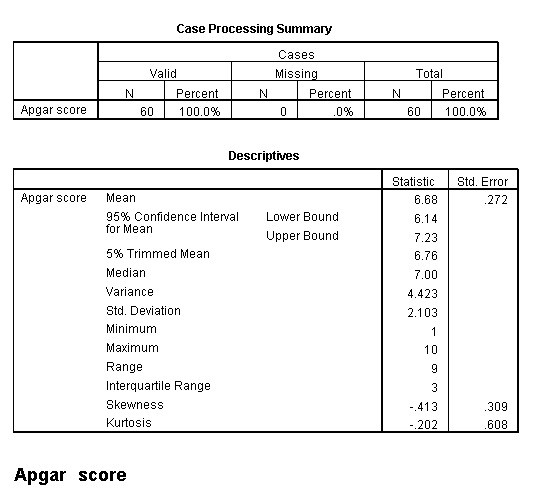
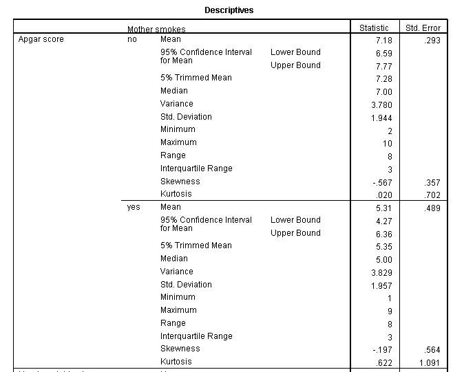
Although SPSS has a menu choice labeled Descriptives, that offers only a limited number of statistics. Instead we will use the Explore menu, which will give us more. (That is the way in which Figure 4.1 in the text was obtained. From the Statistics/Summarize/Explore menu,add Apgar, Wtgain, Gestational age, and Annual income to the dependent variable list. The basic descriptive statistics are supplied by default, but you could select others by clicking on the Statistics button. From the Plot button you can choose whatever plots you want The resulting output is shown below.
These data at first look like rather uninteresting statistics, but they aren't all that bad. I can find something in them to talk about, but, then, that's my task. (Some people think that all statistics are uninteresting, but we know better--don't we.) Perhaps some of the most interesting statistics here are the minima and maxima. Notice that at least one child has an Apgar of 1, which is a very serious condition. The mean is 6.68, with a standard deviation of 2.1, which suggests that there are a number of children whose apgar scores are uncomfortably low.
I have not displayed the results for the other continuous variables because it would take up too much space. But you could do that on your own. If you did so you would find the following results.
All mothers gained weight during their pregnancy, with a low of 8 and a high of 75 pounds. 75 pounds is a lot to gain in any situation, and we may want to look at that later. The average gain is a substantial 27 pounds. In the past obstetricians wanted their patients to gain, but more recently that have taken a more conservative approach. We might suspect that the mean of 27 is distorted by the one score of 75, but the median (computed by looking at the frequency distribution) is 25, so 27 isn't way out of line.
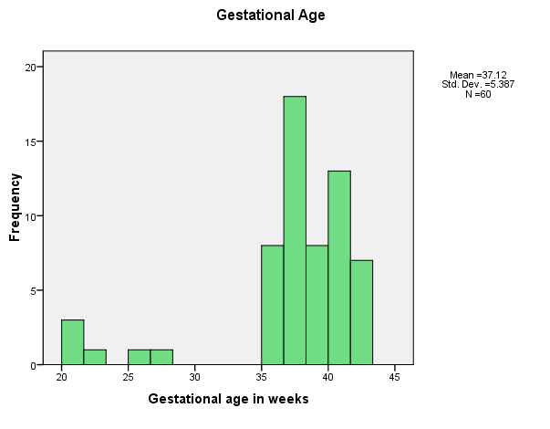
The mean gestational age is 37 weeks, whereas we normally think of full-term as 40 weeks. Moreover, one child was born as young as 20 weeks, which is very very early. Notice the size of the standard deviation on that variable, as well.
Finally, we have a tremendous spread in income, from $10,000 per year to $180,000. The mean is 55.78, which strikes me as somewhat high for this age group, but this may really be biased by the outliers. We could ask the descriptives procedure to give us the median, but we will see the median soon when we look at boxplots, so I will save the space. Jennifer and Colin are probably making a very nice combined income as the reward for their yuppiedom, so they'll fit right in.
If you wanted to break down the data by a second variable, such as looking at Apgar scores for mothers who smoked versus mothers who did not smoke, you could do what you have done above, but add the Mother Smokes variable to the Factor List box. That would give the following printout, which shows that Apgar scores for infants whose mother smoked were almost two points lower on average, which is nearly a full standard deviation low.
It is often very useful to graph data. (Probably I should say that it is always useful to graph data.) This is especially true with continuous variables where simple frequencies are hard to interpret. We could graph Gender, Smokes, and Prenatal, but we pretty much know what those variables look like already. But it will be very useful to graph the other variables, first by looking at histograms.
Using Graph/Legacy Dialogs/Histogram, plot a histogram of each variable. We will start with Apgar, and see how to modify the plot to suit our tastes. Then we will move on to the other variables. (I should point out that recent versions of SPSS allow you to build your own graphs, through Chart Builder, or use the earlier approach, called Legacy graphs. I am not going to discuss Chart Builder, but you can play around with it and draw some very nice graphs.
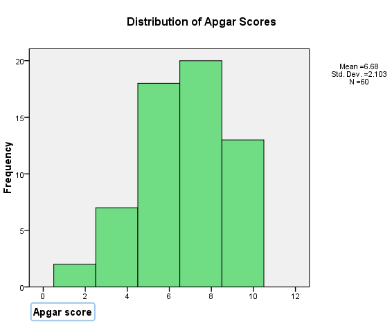
The initial plot of Apgar follows. Yours may look somewhat different, depending on the number of "bins" that SPSS chooses to use.
I think that is kind of an ugly plot. (Actually, I cheated to make it look like that so that I could then write what comes next.) The intervals are quite wide, and the label on the X axis is set off to the side. But, if you double click on the graph on the SPSS output page, magical things happen and you have a whole new set of menus to work with.
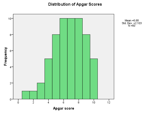
If you double click on the X axis label of the version that appears you can supply a new axis label, such as "Apgar Score." You can also go to the new menu and ask that the label be centered. Then if you click on the X-axis, a dialog box will open and allow you to specify the number of bins. Thus you can change the number of intervals (bins) from 5 to 10, which should make things more readable. You can also chose supply a label for the Y axis if you wish.
It pays to play around with the other choices you have, but I don't have the space to do that here. The results of the changes that I have made are shown below, and I think it is a much more useful figure.
Notice that these scores are reasonably symmetrically distributed. They are cut off by a ceiling at 10, and are somewhat negatively skewed, but that skew is accounted for by only 4 subjects, so I'm not going to take it too seriously. As variables go in Psychology, this one is quite well behaved.
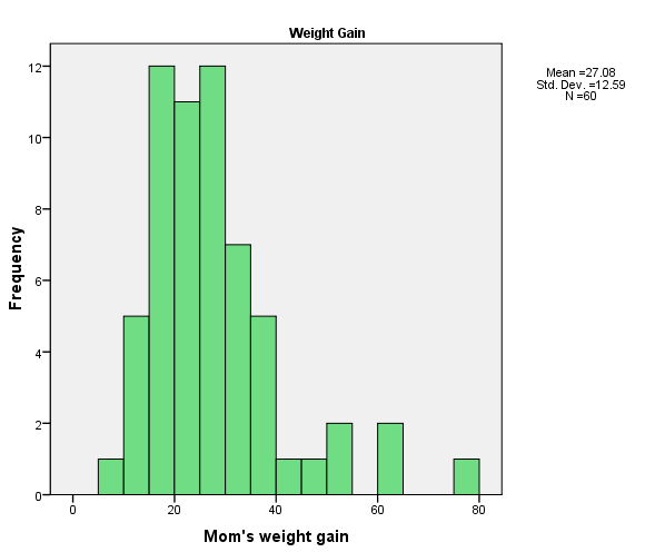
The histogram of the mother's weight gain is shown below, followed by the histogram on gestational age.
You can see that both of these distributions are skewed. The weight gain one is not too bad, though it does have several high outliers. The gestational age distribution is quite skewed, with most of the children being born between about 35 and 42 weeks, for four children born at less than 30 weeks. I'm not sure what to do with these variables, though a square root or logarithmic transformation of the weight gain variable might be in order. I don't know anything that would clean up the gestational age variable. Notice that for both the Apgar scores and the Gestational age scores we had four observations in the negative tail. When we come to look at the relationship between these two variables, it will be interesting to see if those points are from the same four cases.
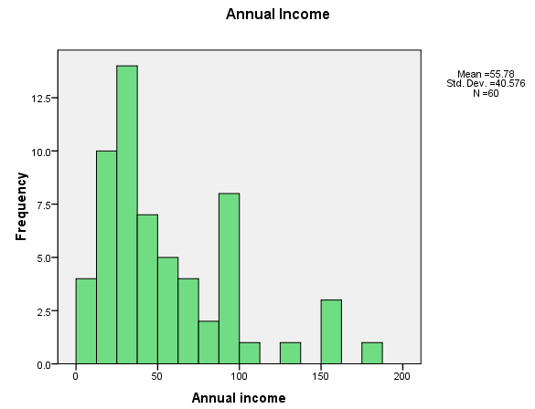
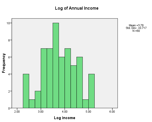
Finally, I want to look at the distribution of annual incomes. People who work with income data often routinely a logarithmic transformation, to diminish the influence of the right tail. If we look at the original (raw score) data we see that it has a very definite positive skew. If we take the logarithm of incomes, things look somewhat better. We will use the log income variable for subsequent analyses. The two distributions are shown below.
You might ask how I obtained the log of incomes. Good question. Simply go to Transform/Compute on the main SPSS menu. In the box to the left labeled Target variable, enter the name of the new variable you want to create (such as logincome). Then in the list of functions to the right, scroll down until you find something that looks as if it will give you a log. (I used ln(numexpr) to get the natural log, but it would work just as well if you used lg10(numexpr) to get the log to the base 10. Double click on that and it will add that function to the box above, with the "?" highlighted. Just double click on Anninc or type Anninc in place of the "?".
We have seen a number of aspects of these data that we should keep in mind. We have an even split of male and female babies, which is what we would expect. We have about 30% of our mothers who received little or no prenatal care, and that may be important. Moreover about a quarter of our mothers smoked during pregnancy, and there is evidence elsewhere to suggest that this is not a very clever thing to do.
Our Apgar scores are roughly normally distributed, although there is a ceiling effect at the maximum possible score of 10, and there are a few stragglers at the lower end. Weight gain and family income are both positively skewed, and can profit from a logarithmic transformation. (Future analyses will be conducted with the transformed variables). The distribution of gestational age is negatively skewed, with four noticeable outliers. We will keep track of those outliers in future analyses. All in all, our data are about what we might expect, and with the exception of Gestational age, are reasonably well behaved (a statistician's term for neat and tidy).
We have looked at our variables one at a time, and have transformed two of them to bring them closer to normal distributions. We now know quite a bit about what the individual variables look like, and it is time to look at variables in combination with other variables. Jennifer and Colin are getting more than a little impatient with our fiddling around. They want to know what to do, and they don't appreciate the fact that one really needs to start at the beginning. (They always were an impatient couple.)
The first thing that we will do is to create contingency tables from the discrete variables. There are not a lot of exciting contingency tables that we can create here, but I need to find something to illustrate what a great job SPSS will do with discrete variables. One relationship that will later be of interest concerns the relationship between Smokes and Prenatal care. That doesn't sound very exciting, but from what I know about neonatal development, I suspect that both of those variables are going to play a role in the child's development. If so, it is important to know if those are independent roles, or whether there is a lot of overlap between the variables. If Smokes and Prenatal are highly related, it will be more difficult to tease out the influence of the individual variables.
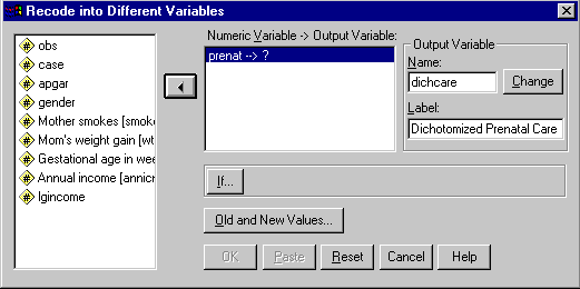
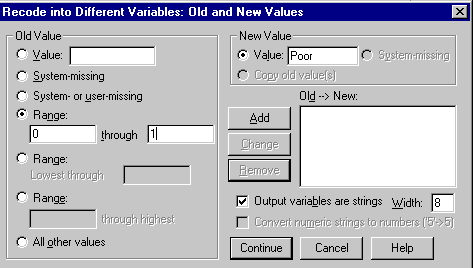
I can illustrate several things about SPSS if I recode the Prenatal variable into two categories. (I am not necessarily advocating two categories in place of four. I am making that split for what it will allow me to show you about SPSS.) I will designate "Poor" prenatal care as care that either does not occur, or is rated in the data as low. Medium and high quality prenatal care I will designate as "Good." In numerical terms, this means that 0 and 1 will be recoded as Poor and 2 and 3 will be recoded as Good. Notice that at the same time that I am dichotomizing the variable, I am changing from numerical values to string values. I do not have to do this, but am doing so to illustrate the use of string variables.
To recode a variable, select Transform/Recode/Into new variables from the menu bar. We want to transform into new variables so as not to overwrite the existing Prenatal data. When you make this selection, you will have the following dialog box, which I have partially filled in.
From the list of variables on the left, I selected Prenatal and moved it to the center box. On the right I entered the name of my new variable ("Dichcare") and supplied a label. When I click the Change box, the new variable name will replace the "?" in the center. When I then click on Old and New Values I will have the following dialog box, in which I can tell SPSS how to do the recoding. Again, this box is partially completed.
To use this box I entered 0 and 1 as the range of the first recoding. I then checked the Output variables are strings box in the lower right. (If I had not done this, it would only allow me to enter numerical values for the recoded values.) Then I entered "Poor" as the New Value, but to complete this action I will have to click on the Add button. Next I will select the range of 2 though 3, enter "Good" as the new value, and again click on Add. At this point I am done, and will click on the Continue button.
When I click on Continue, I back up one dialog box and click on OK. My new variable will now be created.
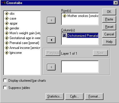
I have now finished recoding my data on Prenatal. To create my contingency table and compute the value of chi-square, I will go to the Statistics/Summarize/Crosstabs selection. This will bring up the following dialog box, which I have partially completed.
Notice that I have entered Smokes as the Row variable and Dichcare as the column variable. But don't click on OK yet, or you will not have the statistics you want. Instead, click on the Statistics button and select Chi-square and Risk in the appropriate boxes, and then click on the Cells button and select Obtained and Expected frequencies. Then run the analysis, from which you will have the following output. (I will show the Risk analysis in a minute.)
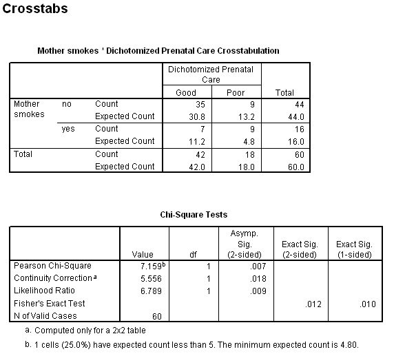
From the contingency table we can see that of those mothers receiving good prenatal care, 35/42 = 83% are nonsmokers. On the other hand, for the mothers receiving poor care, 9/18 = 50% are nonsmokers. This certainly suggests that there is a relationship between smoking and prenatal care. If we compare the individual expected and observed frequencies, we also see that mothers receiving good care are more likely to be nonsmokers, and mothers receiving good care are more likely to be smokers than an independence model would predict.
If you look at the results of the chi-square test you will see that the Pearson Chi-Square, which is the statistic labeled chi-square in the text, is 7.159, with an associated probability under the null of .007. The likelihood ratio chi-square = 6.789 and comes to a similar result. I would not even look at the Continuity-corrected chi-square, or Fisher's exact test, because these marginal totals are not fixed.
Another way to examine the relationship between these two variables is to look at the risk statistics, which are shown below.
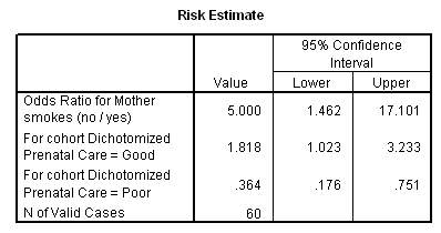
This table is often confusing to read. Starting in the middle we see the label "For cohort Dichotomized Prenatal Care = Good." This presents the odds that someone receiving good prenatal care will be scored "0" on smoking, which represents nonsmoking. The next line is the odds that someone receiving poor prenatal care will be a nonsmoker. For our data, if a woman is receiving good care, she is 1.818 times more likely to be a nonsmoker than a smoker. For someone receiving poor care, she is only .364 times as likely to be a nonsmoker. If we form the odds ratio of these two values, we have 1.818/.364 = 5.000, which means that a women who is receiving good care is 5 times as likely to be a nonsmoker than is a women receiving poor care. Clearly quality of prenatal care and smoking go together. There could be a number of reasons for this relationship, including the possibility that people who smoke are also those who are least likely to search out prompt care, and the possibility that those who do have good prenatal care are advised by their doctors to give up smoking while they are pregnant.
Notice the 95% confidence limits on the odds ratio. Because the chi-square is significant, the interval does not include 1. However the limits are still very wide. We are confident that smokers have less care, but we can't be very precise about just how much more likely they are to have less care.
Some of the most interesting aspects of this dataset become apparent when we look at the correlation among the variables. Here we examine how one variable varies with respect to another. The particular data set with which we are working illustrates some interesting things about correlation and regression.
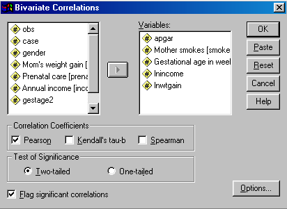
We can't take the space to look at all of the interesting relationships in these data, but a good starting place would be the matrix of intercorrelations of several of the variables. We will choose the continuous variables and one of the dichotomous variables (Smokes). Where we earlier transformed a variable with a logarithmic transformation, we will use the transformed variables.
From the menu, select Statistics/Correlate/Bivariate. This will give you the following dialog box.
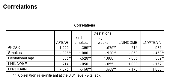
Note that I have selected variables from the left, and they have been entered on the right. I have selected the default choices in each instance, and unless you want to print out descriptive statistics, or deal with missing values in particular ways, you can simply click on OK. This will give you the following table of results. (I have edited this table to remove some information. All correlations were based on 60 cases, and I have removed the actual probability values and left the asterisk, which indicate which correlations are significant at alpha = .05 (*) and alpha = .01 (**).
If we start with the first row, we see that the Apgar score is correlated with whether or not the mother smokes and the gestational age of the infant. It is not correlated with either income or weight gain (nor would it be if we used the raw scores on those variables.) Note also the negative correlation between whether or not the mother smokes and the gestational age of her baby, meaning that smoking is associated with poorer neonatal development. In the table we also see that gestational age is also highly correlated with the log of weight gain, and this makes sense. The longer the mother carries the child, the more weight she is likely to gain. Finally, notice the negative correlation between Smokes and LnWtGain. Does this reflect the often-observed effect that giving up smoking causing weight gain, or is it the result of the fact that smoking causes a lower gestational age, which, in turn, relates to less of a weight gain. We will shortly see one way of getting a handle on this.
When we are interested in the relationships among a whole set of variables, a correlation matrix is helpful. But if we are just interested in one dependent variable, and its relationship to one or more independent variables, then we care about regression.
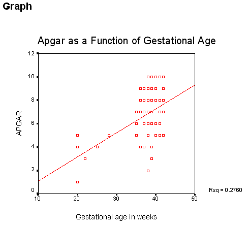
I won't go through all of the possible regressions that we could look at. Instead I'll look at only one simple regression, the relationship between Apgar score and gestational age. We already know that they are positively correlated, and it might be useful to see how quickly Apgar changes with gestational age.
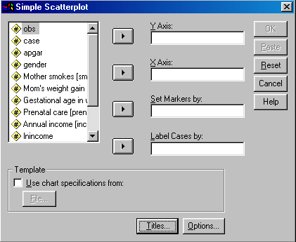
I'll begin with a scatterplot of the relationship between these two variables, with the regression line superimposed. To get this plot, select Graph/Scatter, click on Simple, and then on Define. You will have the following dialog box.
Since we would expect that the Apgar is the dependent variable and Gestational age is the independent variable, select Apgar and put it on the Y axis and put Gestational Age on the X axis. You can leave the rest of the boxes empty. Don't worry about Titles or Options--we'll come to those later.
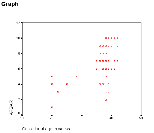
Once you have done this and clicked on OK, you will have the following printout.
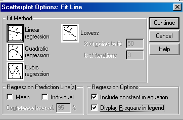
It is a functional graph, but not very attractive. However, there is much that you can do to improve it. First double click on the figure to move it to edit mode. Then double click on the axis labels and center them (and change the labels if you would like). Then go to the menu and select Chart. That will give you a dialog box where you can check Fit Line-total. Then select the Fit Options button and you will see the following.
Be sure that the Linear Regression choice in the upper left is selected, and that both of the small boxes in the lower right are checked. Then press Continue. You can add a title using the Chart menu selection, and close the editing mode by selecting File/Close. You will have something like the following.
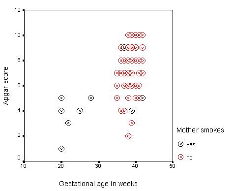
Much nicer!. But there is one more step that would be useful. Above I mentioned the issue about the correlation between smoking and gestational age, and how that might influence the plot. If you go back and do everything that you have already done, but also, when selecting the variables, add Smokes to the Set markers by box, you will get the data points for smokers distinguished from the data points for nonsmokers. You can see that in the graph, although I am not confident that the colors will be distinguishable when this is printed. At least you can do it yourself on your own computer.
Notice that the relationship looks somewhat different for the two groups. We don't have enough data to draw any definite conclusions, but it is apparent that smoking is having an influence on the relationship. For Jennifer, who smokes, this is bad news. She sees that Apgar scores are associated with children who are born early, and she can also see that women who smoke tend to have children of lower gestational age. Smoking is not what she should be doing right now.
When we come to the section on multiple regression we will examine the role of smoking in more detail. At the moment, all that we can say is that it seems to be having an effect. It is confusing what might otherwise be a neat and tidy relationship.
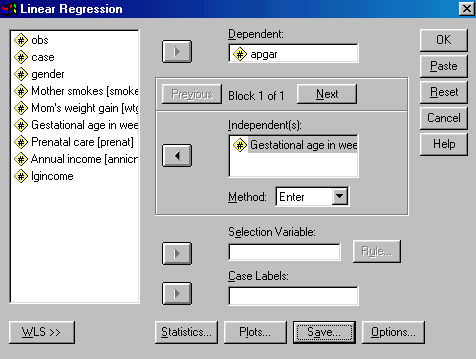
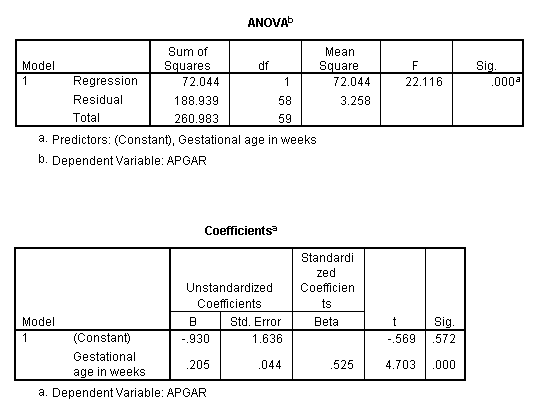
We have looked at the correlation between gestational age and Apgar score, and we have plotted one variable against the other. Now we will look at that some relationship from a regression perspective. We want to gain some understanding of how an increase in gestational age translates into differences in Apgar scores. To do this we will compute the regression of Apgar on Gestage. The dialog box for this is shown below, and we arrive at this dialog box by selected Statistics/Regression/Linear from the menu bar.
Notice that I have filled in the dependent and independent variables. With simple regression, that is really all that you have to do, assuming that you have already examined the descriptive statistics and the scatterplot.
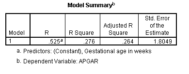
The resulting regression output looks like the following.
The test of significance on Gestational age as a predictor of Apgar is significant at p = .000, which is one way of saying that any non-zero decimal places will be farther out that the 3rd decimal place. The correlation is given as .525, which is what we saw earlier. The test on the correlation (given by the ANOVA table, is significant), as is the test on the slope. With one predictor, these two tests will be exactly the same
From the bottom table, the regression equation is that Apgar = 0.205*Gestage - .930. This can be interpreted to mean that when two children differ by one week of Gestage, they will differ (significantly) by .205 units in Apgar scores. Another way to see this is to look at the standardized regression coefficient. It is 0.525, which means that for two children who differ by a full standard deviation in gestational age, we would expect them to differ by about half a standard deviation in Apgar scores.
We have already looked at some differences in Apgar scores as a function of smoking when we looked at a scatterplot using Smokes as a third variable. We will look at it again more direction in the next major section, when we consider a t test between the smokers and the nonsmokers. But we can perform most (if not all) of that t test using the regression procedure, provided only that we code smoking appropriately. for now, we will just look at the point-biserial regression of Apgar on the dichotomous predictor (Smokes).
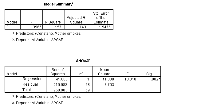
This regression is shown below, without the dialog boxes that generated it.
Here we see the same correlation coefficient we say in the correlation matrix, except that this correlation is positive. For technical reasons, SPSS always reports the correlation given in a regression solution as being in the positive directions. A correlation of .396 is reasonably large, and it is worth pursuing this further. The analysis of variance table tells us that it is also statistically significant, meaning that there is a reliable (negative) difference between the Apgar scores for neonates whose mothers smoke or don't smoke.
The next figure contains the regression coefficients. From
this table we can see that the optimal regression equation is ![]() .
This equation tells us several things. In the first place, you may have
noticed that the intercept (7.812) is the mean Apgar score for the
nonsmoking group. That makes sense when you think about the fact that
the intercept with X = 0, and it will equal 0
when we are looking at the nonsmoking group. Note also that b
= -1.869, which is the difference between the means of the two groups.
Again this makes sense, because a one unit change in X
is associated with a 1.869 unit drop in Apgar, and a one unit change
corresponds to the difference in X between the
smokers and the nonsmokers.
.
This equation tells us several things. In the first place, you may have
noticed that the intercept (7.812) is the mean Apgar score for the
nonsmoking group. That makes sense when you think about the fact that
the intercept with X = 0, and it will equal 0
when we are looking at the nonsmoking group. Note also that b
= -1.869, which is the difference between the means of the two groups.
Again this makes sense, because a one unit change in X
is associated with a 1.869 unit drop in Apgar, and a one unit change
corresponds to the difference in X between the
smokers and the nonsmokers.
The significance test on the slope is t = -3.288, with an associated probability of .002. We will conclude that the slope relating smoking to Apgar scores is significantly different from 0, meaning that Apgar changes with smoking, as we have already seen with the correlation coefficient. )You might think about what implications this might have for a t test on the differences between the Apgar means of the two groups.
These data have something to tell Jennifer and Colin about the health of their potential newborn. First, they tell Jennifer that she should think seriously about smoking if she is pregnant. Second, they suggest that she would be well advised to do whatever she can to carry her child to full term, because full term infants do better. Finally, when you look back at the matrix of correlations, you see that smoking is itself associated with a lower gestational age. It may be that smoking is doing double harm--it may be leading to babies who are born prematurely, and it may be leading to less healthy babies regardless of their gestational age. We will have to wait until we look at multiple regression, which is not covered in this short version of the manual, before we can get a handle on this last point.
We have learned quite a bit about our neonatal development, but some of the most interesting findings lie ahead. It is useful to be able to speak about the relationships between variables, but for some audiences it is more important to be able to speak about differences between groups. When correlation and regression are restricted to continuous variables, those techniques have something unique to tell us. But when we apply those techniques to the case where one variable is a dichotomy, the answer is closely related to the answer we obtain when we focus on group differences. It is the group differences that will interest us in this section.
For completeness, I will start with a one-sample t test. As I say in the book, there are not a lot of times that we have use for that test, unless our one sample is a sample of difference scores, but we should be as complete as practical.
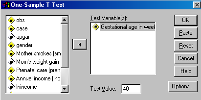
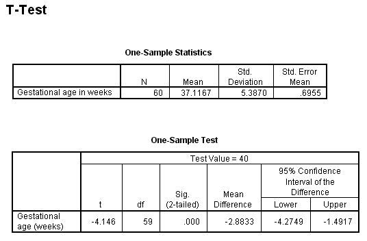
We know that in the general population gestation takes about 40 weeks. Our data have a mean somewhat less than 40, but we don't know if that lower mean just reflects random error. After all, not every sample can come out with a mean of exactly 40 weeks. Testing the null hypothesis that the mean of a single column is equal to some specific value (in the population) is easy to do with SPSS
From the menu select Statistics/Compare Means/One-Sample T Test.. You will obtain the following dialog box.
Notice that I have filled in the dependent variable (gestational age), and I have set the population mean to 40 in the box at the bottom.. There is no need to set any options in this example, though I encourage you to click on that button and see what choices you have. When we run this analysis we obtain
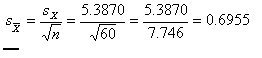
Here the sample mean is 37.1167, which is 2.8833 weeks below the hypothesized mean of 40. The standard
error of the mean, which is
 ,
,
and is given in the last column. Dividing the difference between the sample and population mean by the standard error gives us t = -2.8833/0.6955 - -4.146. This value appears in the lower table. Notice that the two-tailed significance level of this t is given as .000, meaning that the probability is less than .0005 that we would have a mean difference this large if the null were true. (I say less than .0005, because anything larger than that would have been rounded up to .001.) So we can reject the null hypothesis and conclude that our sample was drawn from a population with a mean somewhat below 40 weeks. I don't know if this speaks to a peculiarity in our sample, or to my ignorance of the exact length of gestation, though a quick search of the Internet suggested that others think as I do.
The second table also includes the 95% confidence limits, which are -4.27 and -1.49. The value of 0 is not included within these limits, and that is in line with the hypothesis test. There is a probability of .95 that limits formed in the way that these were would encompass the population mean. That is an awkward way of avoiding the ire of statisticians, which I would surely draw if I suggested that the probability is .95 that the true mean is between -4.27 and -1.49 weeks below 40 (i.e. 35.73 and 38.51 weeks). None of us like to draw the ire of statisticians, even if they are being picky.
The previous example probably didn't have you on the edge of your seat in anticipation of the result, but it's the best I could do given this sample. (It's surprisingly hard to find examples that will keep people on the edge of their seats for every statistical test--even assuming that I can get them on the edge of their seat for any test.) But at least it didn't ask a completely stupid question. When it comes to asking about two (or more) groups, there are several more interesting questions to ask.
It is commonly believed that smoking is not a great thing for pregnant mothers to be doing. However there is often a difference between "commonly believed" and "known," and these data give us the opportunity to explore that question in a meaningful way. To do so, we will compare the mean Apgar score of infants whose mothers smoked with the mean Apgar score of infants whose mothers did not smoke.
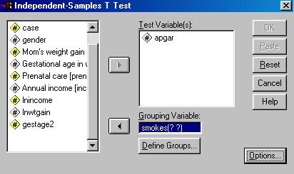
I prefer to look at the means before I run the test, but it will save us space if we use an independent samples t test to test our null hypothesis and have it write out the group means along the way. Begin by selecting Statistics/Compare Means/Independent-Samples T Test. This will bring up the following dialog box, which I have partially filled in.
Notice that I have entered Apgar as the test variable, and Smokes as the Grouping Variable. Notice also the two question marks after the name of the grouping variable. We will replace the question marks with the values of Smokes that distinguish the two groups. Click on Define Groups and you will have the following dialog box.
Since the groups are coded 0 and 1, you can enter 0 in the first box and 1 in the second. If we had been using Prenatal and wanted to create two groups as we did when we recoded them as Poor and Good, we could click on the Cut point radio button and then enter 1.5. Then anything below 1.5 (which would be 0 and 1) would form one group and anything above 1.5 (which would be 2 and 3) would form the other. For Smokes, I just enter 0 and 1 and click on Continue and then on OK. This will provide me with the following printout.
I fiddled with the second table by double clicking on it, then double clicking on the individual cells, and then shortening some entries. I also used my mouse to slide the cell boundaries. You should experiment with this kind of fiddling, especially if you are ever going to cut and paste between SPSS and a word processor. SPSS doesn't seem to have considered that you might want to move output to another document, and so they don't worry about how wide the output is.
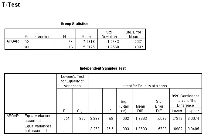
From the first of these tables you can see that the means of the two groups are noticeably different. Mothers who smoke have children with a mean Apgar score that is nearly 2 points higher than the mean Apgar score of infants of mothers who do not smoke. (we saw that at the end of the section on correlation and regression. Notice also that the standard deviations of the two groups are remarkably similar, meaning that we are not going to have to worry about heterogeneity of variance.
In the second table we start off with Levene's test of homogeneity of variance. This is the same test discussed in the text. Here we can see that there is no evidence suggesting that our variances are different (the probability value associated with this test is .822.) That means that we can continue with the row that is labeled "Equal variances assumed." (If Levene's test had rejected the null, we would have moved to the bottom row.)
In the column headed t we find a t of 3.288, with 58 df and an associated probability of .002. Clearly we can reject the null hypothesis that the two population means are equal. We also see the mean difference and the standard error of the difference, along with the upper and lower confidence limits.
If you thought that it was important, you could run your own t test on the Apgar scores of girls and boys, or on the dichotomized Prenatal care variable. I will leave that to you to do. As you might expect, there are no sex differences, but there are differences due to prenatal care. An even more interesting analysis for you would be to compare the mean gestational age of the two smoking groups. We know that it is not good for a child to be born early, and it would be worth knowing whether early births are associated with smoking. Again, I will leave that analysis to you, although you should have a pretty good idea about the answer to that from what you know about the correlation between Smokes and Gestage. I think you may be surprised by the results. If so, you might think about the way in which that variable was distributed.
This example does not allow us the opportunity to perform a meaningful repeated-measures t test (known to SPSS as the Paired Sample t test), but you should be able to figure that out on your own. You would simply click on the two different measures, and then add those to the window on the right. Then your analysis will run as soon as you click OK. The output is readily interpretable.
I have restricted this section to two simple examples. In the first, we asked if the infants in our study were of normal gestational age. If so, the mean on that variable should be approximately 40. In fact, we concluded that it was significantly less than 40, though we didn't have any explanation for that finding.
We also learned that smoking and neonatal development don't go together. The t test for two independent samples showed a significant difference between the infants of mothers who smoke and those whose mothers do not smoke. Again, Jennifer is going to have to decide if she would rather look trendy and smoke, or whether she would give her child a better start in the world. (Lest you fear that poor Jennifer is taking all the heat and Colin is out of the picture, there is some evidence that suggest that having dads who smoke isn't such a good thing either. Unfortunately, we don't have that variable in our data.
Last revised 12/1/2010
dch