Alex Messinger CS142

Assignment 3: Rationale for revisions

University of Vermont Continuing Education recruits and registers students for several programs that serve non-traditional student audiences.   Several of these programs require completion of a lengthy application form.   According to usage statistics, the abandonment rate for this form is an incredible 88%.  88 out of 100 users who land on the application form leave before the have completed it.  The top 10 fields where they abandon it are as follows:

Applicant's Signature/Date

10.38%

City

8.61%

Last Name

8.35%

Zip Code/Postal Code

7.05%

Email

6.95%

Permanent Exchange and number

4.84%

Where is Your Parent/Guardian's True, Fixed and Permanent Address

4.75%

Are you a US Citizen?

4.23%

How will this experience fit with your personal and academic goals?

4.19%

Address 1

3.49%


It’s notable that items 2-6 total 36% of all the abandons, and are all within the first part of the form.  This suggests that over ⅓ of all users stop quickly after starting.  

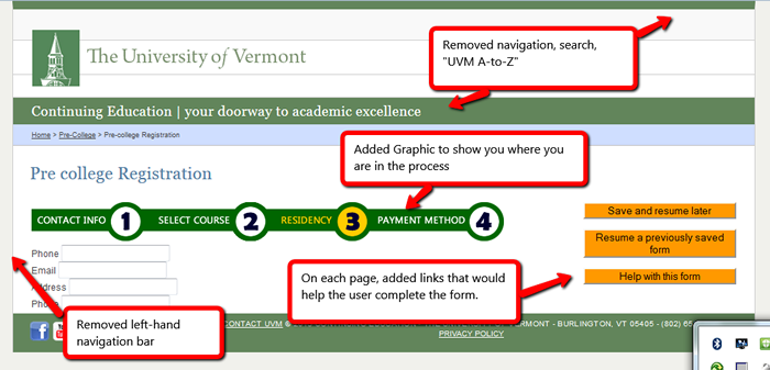
To address this, I’ve made the form into a multi-stage experience.  First, the user gives their contact information.   A hidden field in this form records the academic program that they are applying for.  They can then either progress to the next page to complete the form, or save and return later.  Even if they abandon altogether, we can reach out to them to see why they abandoned and hopefully rectify the situation.

As the builder of this page, there several constraints that may not be apparent to the user.  First, this data must load to banner.  In order for it to load to banner, there must be a way to check for duplicates.  This is why we need items like Social Security Number, former name, etc.

Here are the items that I modified:


  1. Broke the form down into 4 steps.  Breaking the form down into multiple pages accomplishes several goals.  First, if the user only completes the first section, at least we have their contact information and can reach out to them to help them complete it.  Second, it makes the pages shorter and less overwhelming.  Last, by adding a progress bar, it allows the user to visually see what they’ve accomplished and what’s next. (web navigation conventions, Krug p60)
  2. Removed left hand navigation. this wasn’t necessary for completing the form and reduces background noise (Krug, p 36)
  3. Removed navigation in header. links to other UVM Departments, “UVM A to Z”, and search box.  Again, these items reduce the background noise and distraction.
  4. Added a simple right-hand column with “Save”, “Resume” and “Help” links.   This column contains 3 links, and persists on each of the four steps.  Each of these links offers a specific action that helps users complete the form (Krug p 36)
  5. Prepped users for what they will need.    On the first page of the form, there is a short, bulleted list of the items that might delay completion of their registration form.  Assembling these items ahead of time will expedite completion.
  6. I stripped out about 1000 lines of html to make the HTML validate and generally remove several years' worth of code bloat
  7. Allowed input of phone number in any format. As Krug writes-- users should be able to enter the phone number with a hyphen, with a space, parentheses, or without, and scripting should format it.
  8. Added drop-down menu for courses -- much easier than typing it in. this also removed 4 fields. Each new field introduces the opportunity for confusion, and can have a big financial impact.

Screen shot of changes to site