How to construct a
population
pyramid in Excel 2003, 2007, and 2010
You may search
Google for "Population Pyramids in Excel 2007" for instructions for
Excel.
For example this link might be useful: http://www.docstoc.com/docs/7183430/How-to-Create-Population-Pyramids-using-Microsoft-Excel
Go to the US Census Bureau's Site on International Demographic
Data: http://www.census.gov/ipc/www/idb/informationGateway.php
and click on the Data tab, choose the International Data Base (IDB)
link. Under "Search" and "Select Report" choose "Population by
Five Year Age Groups", choose a country,
and click the Submit button below. Then, when the next screen
comes up, you should see the data for your population pyramid.
At the bottom of the data table, below "Source Information" in small
type click on "Excel" to download a spreadsheet version of the data
table. You should
cut the Totals row and move it to the bottom of the spreadsheet, and
you should cut the "Both Sexes Population" Column and move it to the
right of the Male and Female columns. Format the spreadsheet
so
it looks similar
to the China example below.
To practice, you may download the China example below
here
.
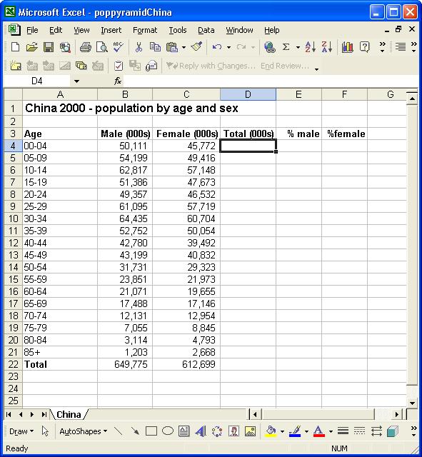
In cell D4 enter the formula =B4+C4.
Copy Cell D4 down to the bottom of the column (cell D21
in example above)
Put the active cell in cell B22 above and click on the
AutoSum
and Enter. This will calcualte the total population of males.
Copy this cell across to row D (D22 in
example
above).
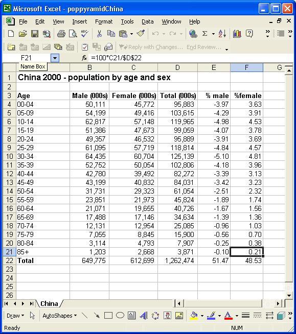
To calculate the percent males in cell E4, enter the formula
=100*B4/$D$22 (notice the direct cell reference to the total
population cell with the use of the $). Some of the
demographic
tables do not include
ages 85 and older, so the total population cell reference may be
different
than the example above (for example D21 instead of D22).
Copy the formula from cell E4 down to the bottom of the
column,
E22 in the example above.
Format cells E4 to E22 to two decimal places by
blocking that range and choosing Format-->Cells, Number Tab,
Number, 2-decimal places.
To claculate the percent females in cell F4, enter the
formula
=100*C4/$D$22
Copy the formula from cell F4 down to the bottom of the
column,
cell F22 in example above.
Format Cells F4 to F22 to two decimal places by
blocking that range and choosing Format-->Cells, Number Tab,
Number, 2-decimal places.
If you have not done so already, Autosum the percent male and female
columns
in the cells E22 and F22 in the example above and
below.
We must fool Excel by making the % male column negative, to make the
population pyramid.
Alter the formula in cell E4 to be = -1*100*B4/$D$22
and copy this formula down to cell E21
The spreadsheet should now look like:
To build the pyramid, we need to choose a horizontal bar chart with
two
series of data (% male, and % female) and the age labels in column A
as
the Category X-axis labels. Block out the range A3 to
A21
, hold down the CTRL (for MacOSx use the Command) key and block out
the range E3:F21
For Excel 2003
Click on the chart Wizard button, select the
default of clustered BAR
chart with horizontal bars. Click Next.
Click Next again. In the Titles tab enter the title: Population
Pyramid
for China, 2000, Data Source: US Census Bureau
Enter Percent for the Y-Axis label, click next,
and
choose as an object in this sheet. Press Finish. You
should
have a graph
that has two series of data.
For Excel 2007 Choose
the Insert Menu, Bar chart (2D Cluster Bar). You may need to
drag the chart to the upper right to uncover the data on the
sheet. Choose the Layout tab in the Chart Tools section of
the tool bar, and choose Chart Title, Title Above Chart, and enter
Population
Pyramid for China, 2000, Data Source: US Census Bureau. You
may need to lengthen the chart frame so the chart is not so
compressed along the vertical axis. Choose Axis Titles,
Primary Horizontal Axis Title, Title Below Axis, and enter Percent
as the axis label. Choose Axis Titles again, Primary
Vertical Axis Title, Horizontal Title, and enter Age Class
as the axis label.
For
Excel 2010 Choose the Insert Tab, Bar chart (2D Cluster Bar).
You
may need to drag the chart to the upper right to uncover the
data on
the sheet. Choose the Layout Tab in the Chart Tools
section of
the tool bar, and choose Chart Title, Title Above Chart,
and
enter Population Pyramid for
China, 2000, Data Source: US Census Bureau.
You may need to lengthen the chart frame so the chart is
not so
compressed along the vertical axis. Choose Axis Titles,
Primary
Horizontal Axis Title, Title Below Axis, and enter Percent as the axis label.
Choose Axis Titles again, Primary Vertical Axis Title,
Horizaontal Title, and enter Age
Class as the axis label.
To format the pyramid, grab a corner of the graph and expand it so
you
can see it clearly.
For Excel 2003 Put
the tip of your mouse arrow on one of the bars on the left so it
says "Category Axis" and double click.
Choose Patterns tab and set the major and minor tick marks
to
None , tick mark labels to Low, and from the Scale
tab set Number of Categories between tick mark labels to 1,
click OK.
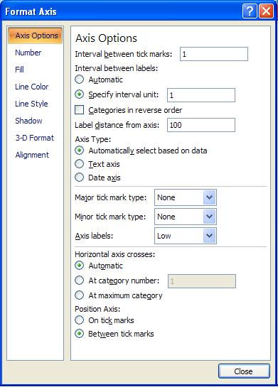
For Excel 2007 Put the tip of the mouse
arrow on one of the bars on the left over the age ranges (for
example "30-34") so it says "Vertical (Category) Axis", right
click, and choose "Format Axis". In the Axis Options
choose the radio button "Specify interval unit:" 1, and Axis
Label Low (see image below). This should move the age
range labels out to the left side, then click on Close.
For
Excel 2010 Put the tip of the mouse arrow on on of the bars on
left
over the age range label (for example "30-34") so it says
"Vertical
(Category) Axis", right click (or double click on Macs),
and choose "Format Axis". In the Axis
Options choose the radio button "Specify interval unit:" 1, and
Axis Label Low (see image below). This should move the
age range labels out to the left side, then click on Close.
In Excel 2003
Double click on any of the bars in your pyramid, and in the
Options Tab
area set the Overlap to 100 and GapWidth
to 0
. Click OK.
Double click the horizontal axis, in the Number Tab
select Custom
and for type enter 0;0 and click OK. Click
on the
scale tab and set
the major unit to 2, click OK.
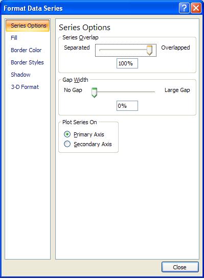
In Excel 2007 Right Click on any of the
blue or red horizontal bars, and choose Format Data Series and
set the overlap to 100% and the gap width to zero, click on Close (see image below):
In Excel
2010 Right Click (or double click for Macs) on any of the blue
or red horizontal bars, and choose Format Data Series and
set the overlap to 100% and the gap width to zero, click on Close
(see image below):
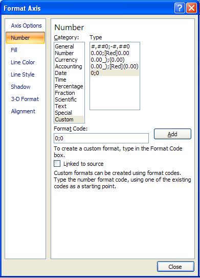
For Excel 2007 Right click on one of the percent
numbers in the horizontal axis, and choose Format Axis.
Click on Number in the left navigation bar, and type in
0;0 in the Format Code: box and click Add and
then Close (see image below):
For Excel 2010
Right click (double click) on one of the percent numbers in
the horizontal axis, and choose Format Axis. Click
on Number in the left navigation bar, and type in 0;0
in the Format Code: box and click Add and then Close
(see image below):
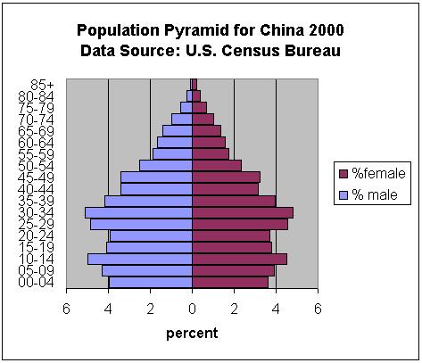
In Excel 2003
Your pyramid should look something close to:
In Excel 2007 and 2010 your pyramid should look something
like:
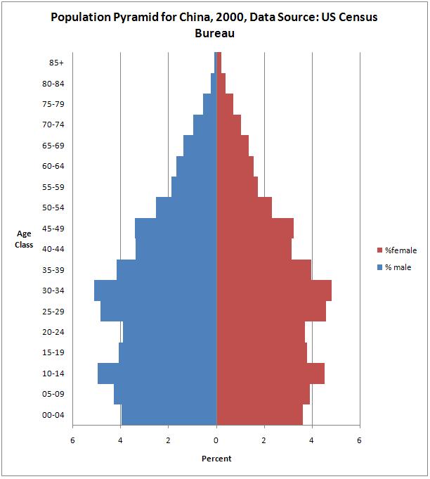
You should notice the percentage of males and females within each
age
class is not equal. Why might that be? Also why are
there
two bulges in the pyramid around 10-14 and 30-34 age groups?
You should interpret your own population pyramid addressing these
types of questions. Assuming reproductive trends remain the
same, will the population be growing in the future? Are
there any baby booms or echos of baby booms? Are the sex
ratios equal? If not, why not?