Accessibility by Design

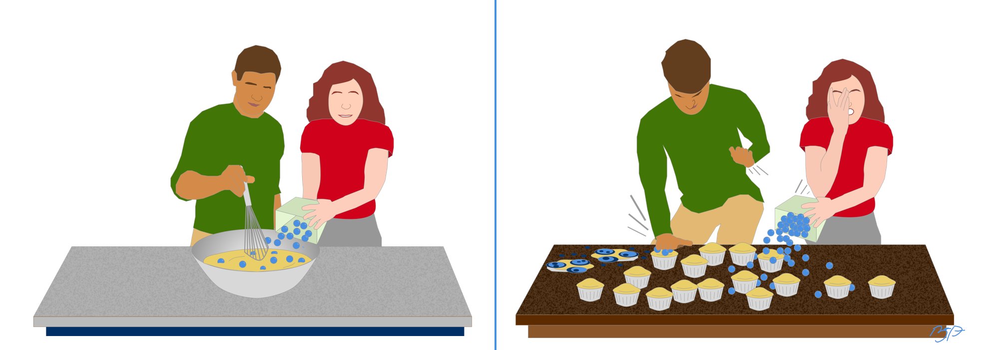
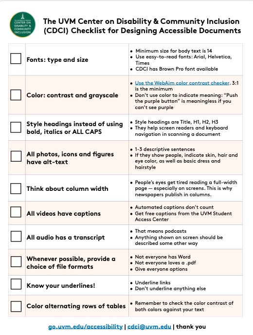
Inclusive designer Brian Parsons created the graphic below back in 2020 to help people better understand why it makes sense to build accessibility into every project from the beginning.

  • In the left panel, you have two people making blueberry muffins by pouring the blueberries into a bowl of muffin batter. This represents adding accessibility at the beginning of a project. 
  • In the right panel, you have the same two people trying to make blueberry muffins by smashing the blueberries into the baked muffins. There are blueberries on the counter, and exploded atop the muffins. This represents trying to add accessibility at the end of a project.


Two panels. On the left, two people bake blueberry muffins, pouring blueberries into the batter as they stir. On the right, the muffins are out of the oven with no blueberries, and the two people attempt to mash blueberries into them, crying, while the muffins explode.

NEW: Plain Language Resources

Where to Start with Plain Language

Looking for basic information about what plain language is, and how to use it? We have a tutorial on where to start with Plain Language

10 Basic Principles of Digital Accessibility

1. Fonts: Type and Size

  • Minimum size for body text should be 14 points or larger. Ask you audience for feedback.
  • Use easy-to-read fonts. These are: Arial, Helvetica, Verdana, Calibri, or Times new Roman.
  • No paragraphs of italic text. Italic text should be used to emphasize words or short sentences, but can be really difficult to read as a paragraph.

2. Color: Contrast and Meaning

  • Use the WebAim color contrast checker. 3:1 should be the minimum for large text, icons, and graphics. For smaller text, like body text, bump it up to 4.75:1.
  • Don’t use color to indicate meaning. “Push the purple button to get in touch” is meaningless if you can’t see purple.
  • Test your designs in grayscale. Some people can't see color at all, and still need your information. If you're on a Mac, use the "Color Filters" accessibility tool to review, or upload your document to the Toptal color-blindness simulator.

3. Headings

  • Headings are Title, H1, H2, H3. You use these instead of simply making the title of a page, section, or paragraph larger, or bolding it.
  • They help screen readers and keyboard navigation in scanning a document.
  • You can still bold or italicize your headings -- as long as they also have heading markup (Title, H1, H2, H3, etc).

4. Alt-Text

  • All photos, icons, and figures should have alt-text.
  • Alt-text should be 1-3 descriptive sentences. Focus on the main point of the image. You don't need to describe the color of the flowers on the wallpaper -- unless you're creating an ad for wallpaper. You do need to describe how many people are in the image, who they are, and what they're doing.
  • If your image shows people, indicate skin, hair and eye color. Also consider basic dress and hairstyle.
  • Haben Girma describes how important it is that alt-text includes BIPOC people (video).
  • Don't be afraid to include color terms. Many blind and low-vision people appreciate being told about colors, such as "dark green forests" or "woodpecker with vibrant orange wings".

5. Column Width

  • Try to use columns whenever practical. People’s eyes get tired reading a full-width page — especially on screens. This is why newspapers publish in columns.
  • Do not justify your text to both sides of the page. Left-justify any text written in a language that reads left-to-right. Right-justify text in languages that read right-to-left.

6. Captions

  • All videos need captions.
  • Automated captions are only 70% accurate, on average. They are still better than nothing.
  • Edited captions are kindness. And if you're posting a video on YouTube, they'll help your search-engine optimization (SEO).

7. Transcripts

  • All podcast episodes need transcripts.
  • Yes, even short ones.
  • Automated transcripts are better than nothing. But edited transcripts are not only better accessibility, they too will help boost your search-engine optimization. Help people find and access your content!

8. Choice of File Formats

  • Not everyone has Microsoft Word.
  • Not everyone loves a .pdf. And .pdfs are frequently inaccessible unless you spend time ensuring full accessibility. 
  • Webpages should be included as a choice. Lots of people have installed browsers, browser settings, and/or stylesheets that help them with reading and consuming webpages.
  • Some people like video, some people cannot stand it. All video should have a text alternative.

9. Link Formats

  • Underline links. Don’t underline any other text for emphasis.
  • Link text should be a different color than body text. Try to avoid making other text a random color for emphasis.
  • Don’t say “click here”. Instead, provide context. Like: 15 Golden Rules for Links.
  • 3-4 words minimum link length. This helps people who have limited mobility in their fingers, hands, and wrists have a larger target to aim for.
  • No surprise downloads. All links are assumed to go to webpages unless you say otherwise. Tell people about (.pdf), (.xlsx) and (.docx).

10. No flashing or blinking

  • Flashing and blinking items, such as animations, can cause migraines or seizures for some viewers.
  • Viewers should be able to stop and start animations. Nothing you include -- animations, videos, audio, ads -- should be set to auto-play.
  • Absolutely nothing that moves faster than three blinks per second. This is the generally accepted threshold for causing seizures and migraines.

Tutorial: Copyright 101

.

Tutorial: Fonts & Readability


Text: Accessibility Resources

Download a checklist of accessibility tips

A thumbnail of a checklist for accessible design

We have a handy checklist in .pdf format of 10 basic ways to make documents more accessible, regardless of platform.