
Tips for success:
- Know what the experts think -- some good articles featured in this page's sidebar
- Use the "Don't Make Me Think" mantra -- on your visitor's behalf -- as you develop your navigation. Don't make people guess "I wonder what's under this item?!?". Be obvious.
- Blame the Web Team! As the resident experts on campus, we are happy to let you blame us when you say "no" to a silly menu suggestion. IE: "The Web Team won't let me add that menu item; we have to follow the recommended navigation. But I could add a prominent link to that page somewhere else."
- Don't reinvent the wheel. Just as you'd visit a clothing website and see familiar words like Pants/Shirts/Shoes/etc., university websites have a shared language -- use it! Not sure what that is? Ask us!
- Don't mix audiences in your navigation. Expecting the reader to scan topics like Courses, Resources, etc. and then introducing an audience member they may identify with like Staff, Current Students is a lot like changing verb tense in a sentence. It's jarring and confusing.
- Don't link outside of your website from the main menu. Not to PDFs nor to external websites. Nothing new here. It's disruptive to the user to leave your website and/or to launch acrobat from the menu.
Recommended unit navigations:
The Web Team has assimilated all of the best navigation tips out there and taken the time to look at the academic unit menus university-wide. In other words, we have done the heavy lifting for you and hope you will use these recommended navigations:
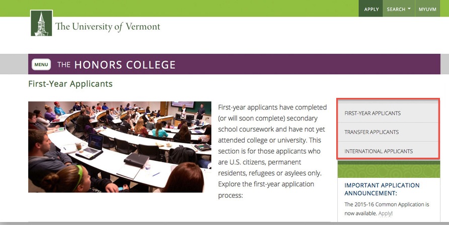
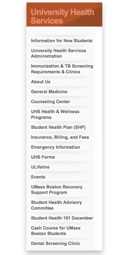
- Academic departments
- Colleges
- Non-academic units: We are happy to work with you to develop your nav. Though it is easier to "standardize" academic units, that doesn't mean that say, the Office of Sponsored Project Administration or the UVM Janitorial Services website shouldn't do some navigation-shopping. Ideally, you want your navigation to resemble those at other universities to make it easy for people to recognize terms between institutions--when searching or visiting your site. Navigational item choice is not the way to express one's creativity -- it's all about keeping it simple, obvious and recognizeable.
