 CSS Div Be Careful When You Size Your Divs
Search MS Office A-Z | Search Web Pages/ Design A-Z
CSS Div Be Careful When You Size Your Divs
Originally meant as a simple tool to group page elements, the DIV tag gives designers additional flexibility and control over layout when it's combined with Cascading Style Sheet (CSS) properties.
|
Designers use the DIV to create complex page layouts without using tables. Unfortunately, as layouts become more complex, browser compatibility problems increase.
Compatibility Problems With HEIGHT And WIDTH
Consider one of the simplest layouts around: two columns placed side-by-side. One contains the navigation menu and the other contains page content. This seems like the ideal candidate for transition from a table-based layout to a CSS layout.
It makes sense: both DIVs and tables can be nested, have HEIGHT and WIDTH attributes set, contain borders, etc. However, there is one big difference in behavior. If you understand this issue, you'll save yourself a lot of frustrated debugging time. Make a note of this:
Table cells stretch to fit the content placed inside them, but DIVs may not!
Like so many annoying design issues, the basic problem is not with the CSS rules themselves, but how browsers choose to interpret them.
Mozilla, Netscape, and Opera browsers interpret these values as the exact measurements and don't allow a DIV's HEIGHT or WIDTH values to extend beyond what you specify. So if you set the HEIGHT and WIDTH properties for a DIV and then insert images or text that takes up more space, the display will be a jumbled mess.
Internet Explorer is much more forgiving. It considers HEIGHT and WIDTH values to be minimum values and expands the DIV to contain all the content you want - just like a table cell.
Who's right? Well, Explorer isn't following the CSS standards released by the World Wide Web Consortium (W3C) while the other browsers are. It may seem like Explorer is doing you a favor, but consider the result if you're using absolute positioning to place all page elements. If one DIV displays larger than you expect, other important content may be hidden from view!
Compare Explorer And Netscape Displays
Look at the HTML code below. Pay particular attention to the HEIGHT and WIDTH values on the classes and on the images inside the HEAD section:
Inside the BODY section:
Note that the CSS rule sets the WIDTH of the navigation DIV to 125px, but we placed an image inside the DIV itself that's 163px wide. Also note the HEIGHT values on the two DIVs. Both are set to 75% of the browser window, but the navigation DIV may need more room than that.
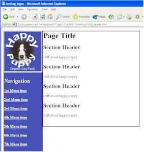
Here's how it displays in Explorer 6.0. The navigation DIV expands to the right to contain the whole Happy Puppy logo image and the menu items. Note how the menu DIV is taller than the content DIV.
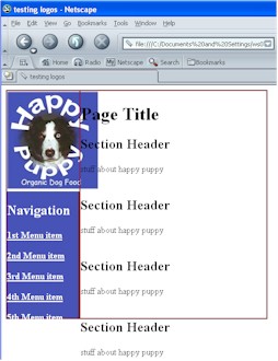
In Netscape 7.1, the entire Happy Puppy logo appears, but the navigation DIV width doesn't stretch to accommodate it. That's why much of the content DIV text over-writes the logo image. The height of both DIVs is fixed at 75%, so the extra content just runs out of both into the white space below.
Neither page looks that great, but the Explorer version is at least readable.
Nested DIV Solution For Explorer
Even though the Explorer version looks better, it still isn't perfect. Fortunately, it's easy to fix - although this is an Explorer-only solution!
Place both DIVs into a container DIV that's set to 100% of page height and set both interior DIVS to 100%. They will fill up the container DIV and the height of both will be equal.
Change the HEIGHT property of both DIVs to 100% and add this style class to your CSS rules: .container{height:100%} and then apply it to the container DIV in the BODY section:
Here's the result in Explorer:
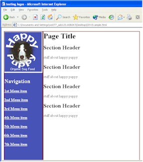
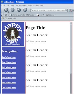
The display in Netscape doesn't change when you do this, but the Explorer version is close to what you expect. If you're sure that all (or at least the vast majority) of your visitors are using Explorer, this solves your problem. It's a great, table-free layout solution.
The Overflow Property
If you need a more cross-browser solution, perhaps the OVERFLOW property is for you. The W3C standard describes the situation like this:
"Generally, the content of a block box is confined to the content edges of the box. In certain cases, a box may overflow, meaning its content lies partly or entirely outside of the box..."
The OVERFLOW property can have one of four different values:
|
Adding the OVERFLOW property to both DIVs keeps the content inside the DIVs, but also creates a "frame" feeling that may not please either designers or visitors.
When we add the "overflow:scroll" CSS rule to the container DIV, we get this display in Netscape 7.1 and Explorer:
Note the scroll bar on the right side. The content of the container section will scroll while the navigation remains static. It does give a "framed" feel, but may help keep visitors oriented if you have some extremely long pages.
CSS Div Be Careful When You Size Your Divs