In this lab you will learn how to take a Excel table and X-Y Scatter graph and population pyramid, and import them into a Word Document. This week we are using Excel as a graphing tool for analyzing data. We will also us PowerPoint to create a cover sheet.
First, for the spreadsheet table. Create your spreadsheet and X-Y Scatter graph in Excel. With your mouse, block out the part (or all) of the spreadsheet that you want to be a table. Next, pull down the Edit menu and choose Copy.
Open Word and put the cursor where you would like to table to appear. Then either click on the clip-board/paste button, or pull down Edit and choose Paste, and the table should appear in the Word document.
Use the same procedure for copying the graph: Click on the graph so there are small black boxes around the graph. Then choose copy, switch to Word, place your cursor, and choose Paste. Do the same for the population table and pyramid graph.
Hints: You must format the graphs just the way you want it in Excel first. Have the graphs about the size on the screen that you want it on paper (don't make them too big). Save your files often as you do this so if things screw up you don't have to start at the very beginning again. Once the graphs are in Word, you may move them around, but you may not easily change the inside of them (like headings, colors, fonts etc.).
MAKING TITLE PAGES WITH POWERPOINT
MS-Powerpoint is an easy to use clip art graphics package where you can make title sheets, cover sheets, small posters, and slide shows. To get into Powerpoint, double click on it from the Start-->Programs menu in Windows. Choose Blank Presentation first, then choose the slide-type. To add a background, pull down the Format menu, and choose Apply Design. To Add clip art, click on the button of the picture of a cartoon-man's profile, or pull down the Tools menu and choose Auto- ClipArt. If you are connected to a color printer, you can print your PowerPoint slides in color. Otherwise they will be black, white and gray-shaded. If there is time in lab, your instructor will demonstrate a slide show presentation.
The following URL is a good source for data on the web: http://www.uvm.edu/~jleonard/cdae85/data.html
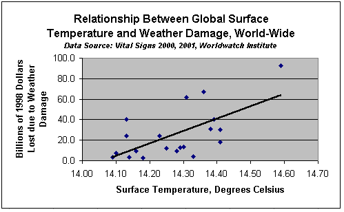
Your second page should look something like this:
|
Global
|
||
|
Losses
|
Surface
|
|
|
Billion of
|
Temperature
|
|
|
Year
|
1998 Dollars
|
Celsius
|
|
1980
|
2.8
|
14.18
|
|
1981
|
13.3
|
14.30
|
|
1982
|
3.4
|
14.09
|
|
1983
|
9.5
|
14.28
|
|
1984
|
3.4
|
14.14
|
|
1985
|
7.2
|
14.10
|
|
1986
|
9.4
|
14.16
|
|
1987
|
13.0
|
14.29
|
|
1988
|
4.2
|
14.33
|
|
1989
|
12.2
|
14.25
|
|
1990
|
18.0
|
14.41
|
|
1991
|
31.2
|
14.38
|
|
1992
|
40.5
|
14.13
|
|
1993
|
24.4
|
14.13
|
|
1994
|
24.1
|
14.23
|
|
1995
|
40.3
|
14.39
|
|
1996
|
61.7
|
14.31
|
|
1997
|
30.3
|
14.41
|
|
1998
|
92.9
|
14.59
|
|
1999
|
67.1
|
14.36
|
Your discussion of the graph should start here. Be sure that the table and the graph stand alone, that they both contain the source of data, and are fully labeled. In your discussion talk about what kind of graph it is, what the graph shows, and interesting trends. In other words, interpret the graph and explain why it is interesting. Include a complete reference citation to where you found your data here also. For example, I found these data on the United States Census Bureau's Web page http://www.census.gov.
Your discussion should be two paragraphs long at the very least.
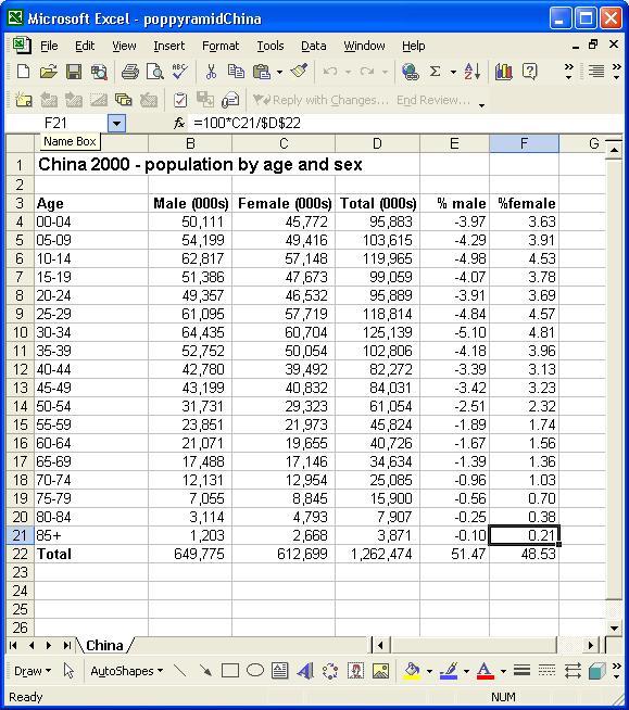
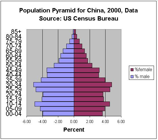
Here's what the population pyramid spreadsheet and graph should look
like: