In this lab you will be introduced to the EXCEL Spreadsheet and graphics package for WindowsXP. Spreadsheets are very useful in modeling any phenomena with measurable inputs, outputs, and results. For example energy flow through an ecosystem, population growth, your GPA, and budgets or other financial matters. Most spreadsheets also have a graphics utility where you can plot or chart the columns or rows of data in the spreadsheet. Below are the instructions to get into Excel and a summary of helpful commands.
TEXT
You may enter Text, Numbers, or Formulas into the spreadsheet.
562.14 Move
your cell-box cursor (big plus sign) by moving the mouse
=b1-b2 and clicking
where you would like to place it.
Save Pull down the File menu and choose Save As. Be sure to start the file name with A: or choose the diskette drive first. Excel automatically puts a .XLS extension on the file.
Directory Pull down the File menu, choose either Open or Save As to display a file list. You may need to change the file extension and/or click on Quick List.
Clear memory Pull down the File menu and choose Close.
Delete Key will delete the contents of the boxed-cell or cells. To select more than one cell in your box-cursor, hold down the left mouse button and drag the cursor around the spreadsheet.
Inserting: Box the rows you wish to insert, then pull down the Insert menu and choose Column or Row.
=SUM(B3:B5) Formula to sum a column from cell b3 to b5. You may also place the box on the cell below a column of numbers and press the Sumation smarticon to insert the formula automatically.
F5 Go to any cell in the spreadsheet. You may also pull down the Range menu and choose Goto.
HOME Returns the column to A
Justify: Click on one of the alignment buttons on the tool bar, or, pull down Format, choose Cells, and then Alignment.
Widen Columns: Click and drag the column wider in the grey area above the sheet.
Show Formulas: Hold down the Ctrl key and press ~ (tilde) Note: Formula view will not align or justify Right.
Retrieve: Pull down the File menu and choose Open.
Exit Excel: Double click on the X box in the upper right corner of the window. Also, you may always pull down the file menu and choose Exit.
Graphing: Box column or row of data. You can then click on the small graph icon, or choose Insert, Chart and choose the type of chart you would like. To edit or make changes to an existing graph, click on the graph so the small box "handles" appear around the edge of the graph. Then you may use the graph menus to make changes.
Preview: Pull down the File menu, chose Print Preview. If the preview does not look like you want, check the printer choice and make sure the range you want has been boxed out. Also, try Page Setup and change Orientation from Portrait to Landscape, and experiment with margins and sizing.
Printing: Pull down the File menu, choose Print. Note: make sure your range is set up correctly.
GRAPHS
It is important to make the appropriate graph for the type of data you are graphing (See details on next few pages). For example, time series data (e.g. population change over time) should be graphed as a LINE graph. Data comparing sizes of things (e.g. population size of different countries) should be a BAR graph. When the major point of a graph or chart is to show how a whole is divided, for example which continents in the world have the most people, a PIE chart can be used. To see if two variables are related an XY Chart is best. For example, the XY would be used to see if the number of mammal species threatened with extinction is related to the amount of deforestation that is going on in many countries.
SAVE YOUR SPREADSHEETS (with graphs) OFTEN. Also, it is helpful to save the spreadsheet with different names so you can back up easily if you wish.
Use the
Graphing Checklist Word Document!
Graphs
Graphs a visual treat for the eyes. They give life to spreadsheet tables and make data more interesting and more useful because patterns in the data are easier to see. Graphs show trends and relationships among data that are often lost in the obscurity of a table of numbers
There are certain generic similarities among all types of graphs. Below is a sample chart that contains the following elements:
Title:
Clearly indicates the major message your graph illustrates.
Subtitle: Supports
and further clarifies the title. Often contains the data source.
Footnote: Contains the source of
your data if not in subtitle.
Legend: Names the data
elements.
X-Axis: Names
the horizontal axis and scale.
Y-axis:
Names the vertical axis and scale.
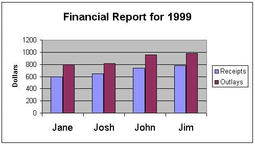
|
1999
|
Receipts $
|
Outlays $
|
|
Jane
|
600
|
800
|
|
Josh
|
650
|
810
|
|
Jon
|
740
|
960
|
|
Jim
|
780
|
980
|
The kind of data you have and the story you want to tell will determine the kind of graph you choose.
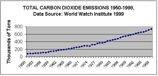
Line and 3-D Line (below): Line graphs are generally used to plot changes in data over time. Each line in a line graph represents a category of data, and each point along the line represents the data's value at a particular time. Time series data such as changes in the level of lake Champlain over the year, or changes in the number of bacteria per ml over a day, should be graphed as a line graph:
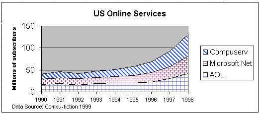
Area and 3-D Area: Area graphs are a variation on the basic line graph in which the lines are stacked and the areas between the lines are filled with different colors or hatch patterns. These graphs show the contribution of one set of values to the whole:
Bar or Column Chart: Column or bar charts consist of a series
of bars, each bar representing value of a particular category. If the
categories do not have any inherent order, the bar chart is the graph of
choice. You can use bar graphs to compare related data at a given point
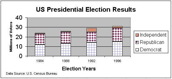
in time. Stacked bar graphs compare different sub-sections of a whole,
for example the relative size of voter turnout from each political party
during Presidential Elections in the US:
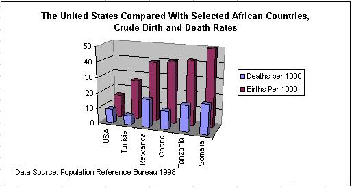
3-D Bar: Below is an example of a 3-D Bar or Column Chart. In this case, the Bars are arranged one in front of another, instead of stacked:
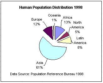
Pie: Pie charts are used to show the proportion of two or more values toa a meaningful whole. The pie slices will be proportional to the percentage each value contributes to the total. For example, the percentage of the human population that was distributed across the continents in 1998 is shown below:
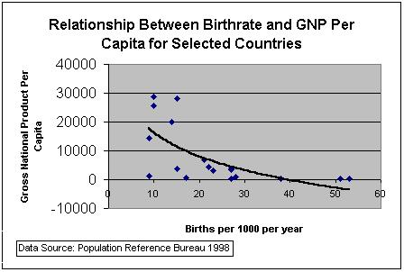
XY Scatterplot: XY graphs, also called scatter plots, are used to show correlation or relationships between different types of data. Often the two sets of data have very different scales of measure, so a bar chart would not work. For example, below is an XY scatter plot showing the correlation between birth rate and GNP per capita for selected countries. A best-fit logarithmic trend line has been added: