 Tables Columns Making a Wild Card Column Width
Search MS Office A-Z | Search Web Pages/ Design A-Z
Tables Columns Making a Wild Card Column Width
Sometimes it's useful to build a table with a "wild card" column width. That is to say, you want a table where you set the width of most of your columns, but set the width of another column to take up the remaining screen area. To see what we mean, take a look at this page. When you re-size your browser window the left column stays at 100 pixels, while the right column changes to fit the screen width. This is a nice effect, but it's harder to achieve then you might think.
HTML allows you to define the width of a TABLE or TD tag in either pixels or percentages. However, unlike frames, you can't define a wild card width by using an asterisk.
To get around this, we might try experimenting with the WIDTH attribute for both the TABLE and the TD tags. For example, we try setting the overall width of your table to 100% of the screen width, while setting the width of our first column to 100 pixels, like this:
<TABLE BORDER="1" WIDTH="100%">
<TR>
<TD BGCOLOR="red" WIDTH="100">
col 1, 100 pixels
</TD>
<TD BGCOLOR="green">
col 2, wild card (I hope
)
</TD>
</TR>
</TABLE>
|
Under Microsoft Internet Explorer, this works exactly the way we want. Our left column stays at 100 pixels, and the right column takes up the balance of the screen.
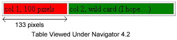
Netscape Navigator, however, renders the table as shown below. Remember that Netscape doesn't like conflicting direction in your TABLE and TD tags. Since Netscape interprets column widths to be a *minimum * width, it resolves the conflict by stretching the left column to be wider than 100 pixels.
|
Ok, since that didn't work, let's try something else. Let's set the width of our first column to be 100 pixels, then set the width our wild card column to "100%." We'll also drop the WIDTH attribute from the TABLE tag. This gives us the following code:
<TABLE BORDER="1">
<TR>
<TD BGCOLOR="red" WIDTH="100">
col 1, 100 pixels
</TD>
<TD BGCOLOR=green WIDTH="100%">
col 2, wild card (I hope
)
</TD>
</TR>
</TABLE>
|
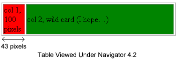
You might think that this would make the browser allocate all of the remaining table width to the right column. Unfortunately, it doesn't. This tactic usually ends up squeezing the first column so that it's smaller than we want. In practice this approach causes the first column to be collapsed until its content refuses to be squeezed any further. The picture below shows our table as viewed under Netscape Navigator.
|
So how can we solve this? The answer is to use the second approach, but to introduce a trick that keeps the browser from squeezing our first column. We can do this by putting a transparent GIF inside that column. We use a transparent, one-pixel graphic that we stretch to be the desired width of our column, like this:
<TABLE BORDER="1">
  <TR>
    <TD BGCOLOR="red" WIDTH="100">
      col 1, 100 pixels
      <BR>
      <IMG SRC="/images/Transhorz.gif"
         WIDTH="100" HEIGHT="1">
    </TD>
    <TD BGCOLOR="green" WIDTH="100%">
      col 2, wild card
    </TD>
  </TR>
</TABLE>
|
Now the browser tries to squeeze the left column as before, but the transparent GIF keeps the column from collapsing. As a result, we get the effect we want.
This approach works well in a variety of situations -- not just when you want a wild card column width. HTML coders often use spacer columns to separate content in a table. But browsers frequently squeeze empty spacer columns to the point where they disappear. Putting a transparent GIF inside these columns ensures that you'll get what you want.
Tables Columns Making a Wild Card Column Width